career website USER FLOW REDESIGN
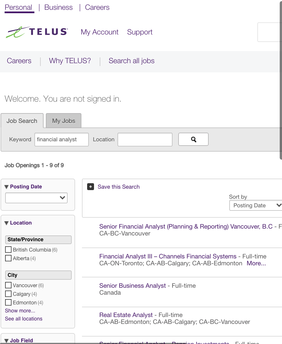
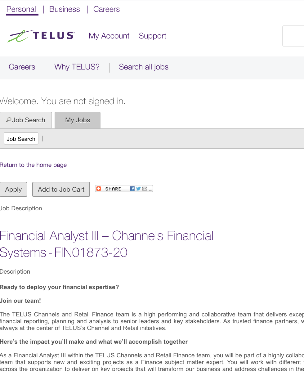
TASK1: Search for a “Financial Analyst” job in Toronto on the career website?
ISSUES WITH THE CURRENT USER FLOW:
Page layout does not enable full mobile experience
Cluttered 3-layer top navigation that distract users from focusing on job search task at hand

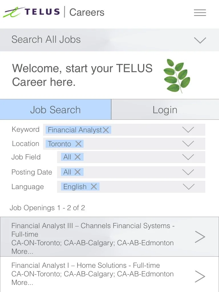
REDESIGN THE MOBILE USER FLOW:
Responsive page layout to accommodate the mobile experience
Improved search filter mechanism
Integrate gesture design into the UI using directional arrows to suggest familiar function (e.g. click to see dropdown, swipe to see next page)


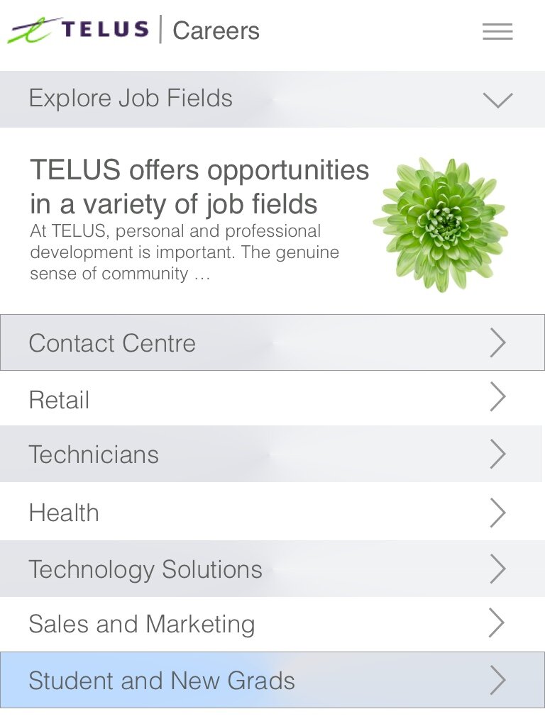
TASK 2: locate student and new grads opportunities on the career website
ISSUES WITH THE CURRENT USER FLOW:
Job by category (field) is located at the bottom of the career websites, requires lots of scrolling to locate
Lack of visual cues of the content hierarchy, users can get lost navigating around the page
Page layout does not optimize full mobile experience





REDESIGN THE MOBILE USER FLOW:
Responsive page layout to accommodate the mobile experience
Added “Explore Job Fields” button at the prominent location to help user navigate on the page