bc campsite reservation ux rEDESIGN
project background
Living in the beautify British Columbia of pacific west coast, camping is one of my family’s favourite activities in summer. To reserve a public campsite in BC, I’ll have to use BC Parks. The government has done a fair job to improve it over the years, but the snags in information design and user flow still make the reservation task unnecessarily difficult from time to time.
Here are some particular things that frustrate me, as well as some wireframe considerations for redesign.
chartjunk on search page
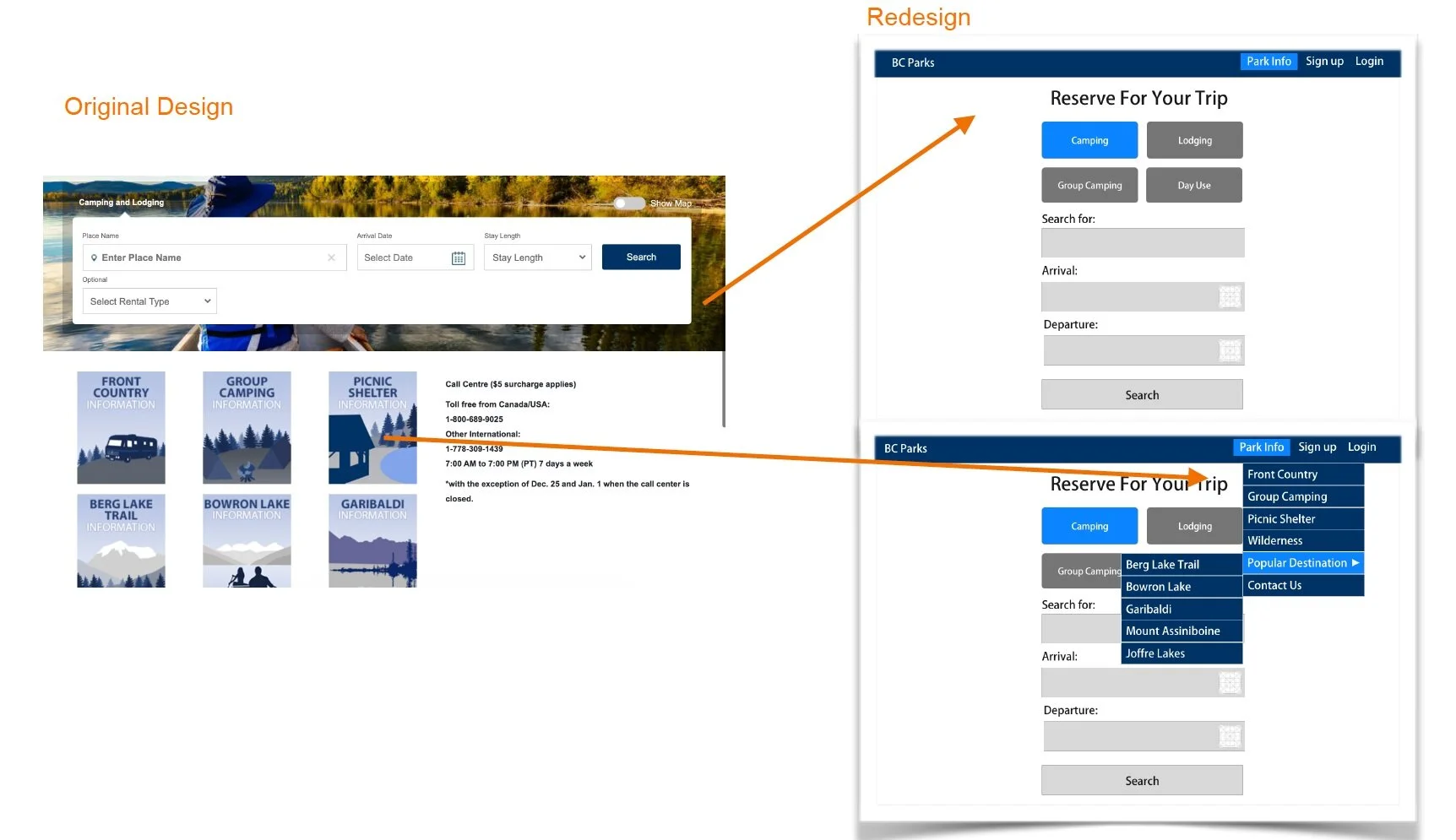
The reservation search page looks nice and clean at the glance, but as you scroll down, there are a 9 tiles with a mix of camping categories and locations beckon for attention. At first, I thought they are quick filters of popular search results that will take me directly to reservation options. After a bunch lot of clicking and maneuvering back and forth, I realize they are ways to display generic information and updates, but there’s no clear indications on why these specific tiles are categorized, and how might users interact with them to reserve campsites for desired camping style, time and locations.
To redesign this, I split the search page into two screens. Keeping the main search screen clean and straight forward with an additional search filter that includes the four common camping style offers (Camping, Lodging, Group Camping, Day Use) to help users narrow down research results. Move and categorize the generic info tile view under a top navigator tab called “Park Info”, where it’s more intuitive for users looking for more info on each category without confusing them as search filters. As a result, users can eliminate the noise on the search page, and achieve the reservation goal with minimal distractions.