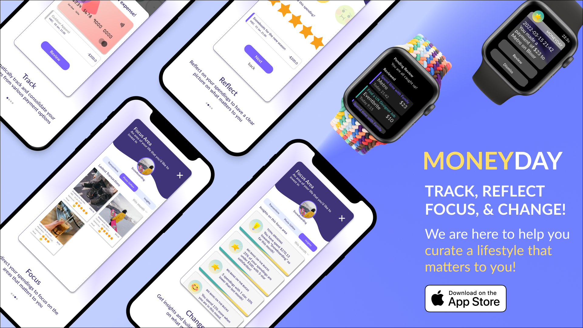
Moneyday: connects your everyday purchases with fulfillment
My Role:
Competitor Analysis
UX Research
UI/UX Design
TeAM:
It’s just me :)
Tools:
Figma, Miro
TIMELINE:
12 weeks
2022
Problem Discovery:
JOJO workS long hours and makeS a 6-digit salary. SHE splurgeS on expensive things to treat HERSELF, but LATELY, THESE THINGS do not make HER happy anymore. JOJO felt stuck.
I came across a few conversations about the relationship between money and fulfillment among high-income salary workers. There seems to be a common struggle that they experience a mismatch between their values and spending habits due to peer pressure and lifestyle inflation. The more money they spend to sustain such a lifestyle, the more they are stuck with their high-paying jobs. There is a constant search for fulfillment through purchasing that often lead to regrets or financial disadvantages.
On the other hand, the existing personal financing Apps are putting heavy weight on the dollar amount and categorization of the transactions but fail to address the intention behind each purchase. I find this gap very interesting. I want to develop a solution that captures the ‘feelings’ we have towards our spending, and leverage that to cultivate spending behaviours that lead to fulfillment.
User Research:
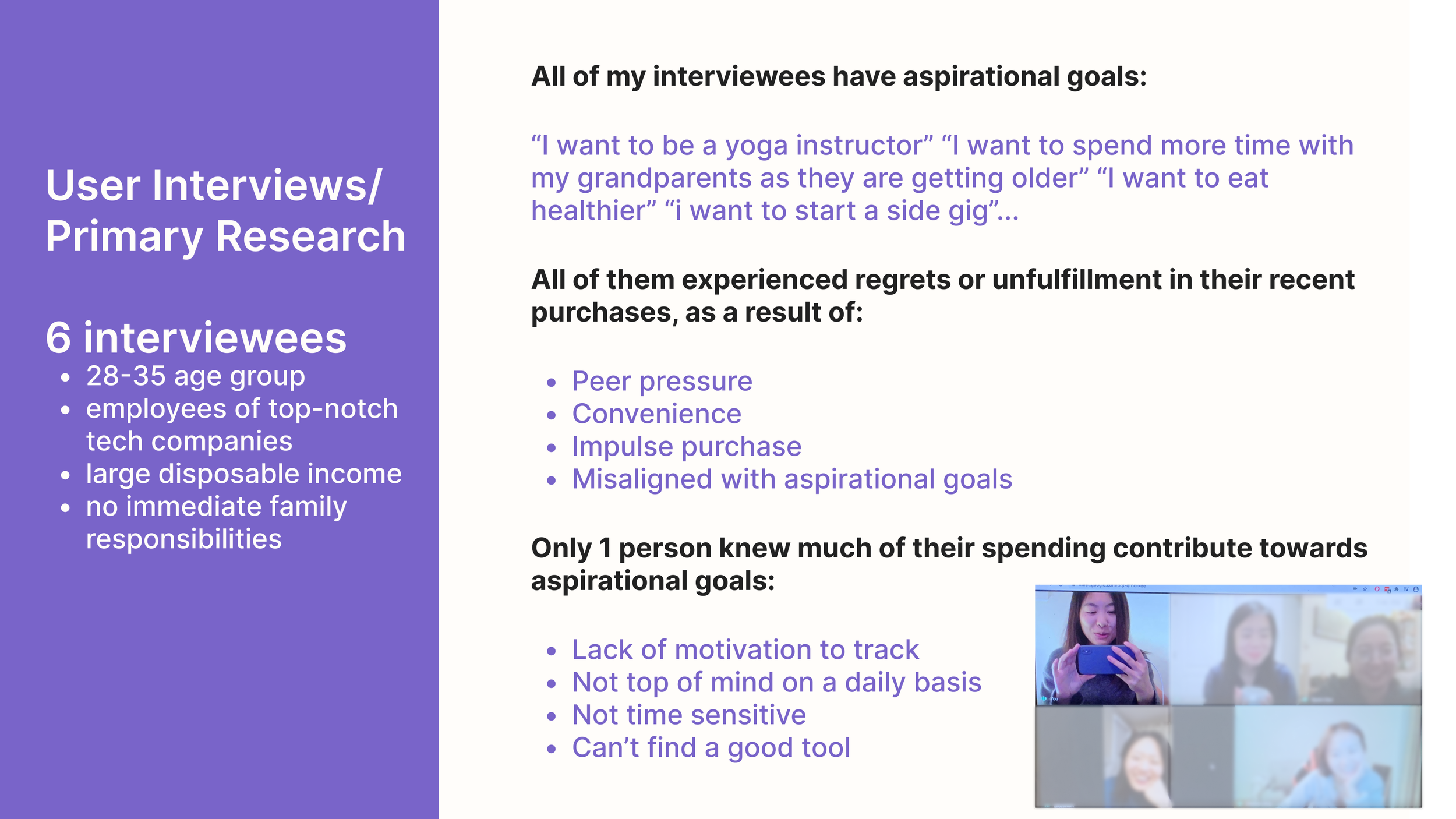
users made a strong connection between goals and fulfillment.
Due to time and budget constraints, I did not conduct a full-fledged user reach. Instead, I did a focus group with 6 individuals through convenient sampling to gather insights from the users that would fit into the high income salary worker bucket. I acknowledge this limitation and didn’t think I have enough data point to create a persona at this time. I would conduct an online survey and individual interviews with at least 25 participants if I were to do this project again.
Through the focus group, I gathered that users made strong connection between goals and fulfillment:
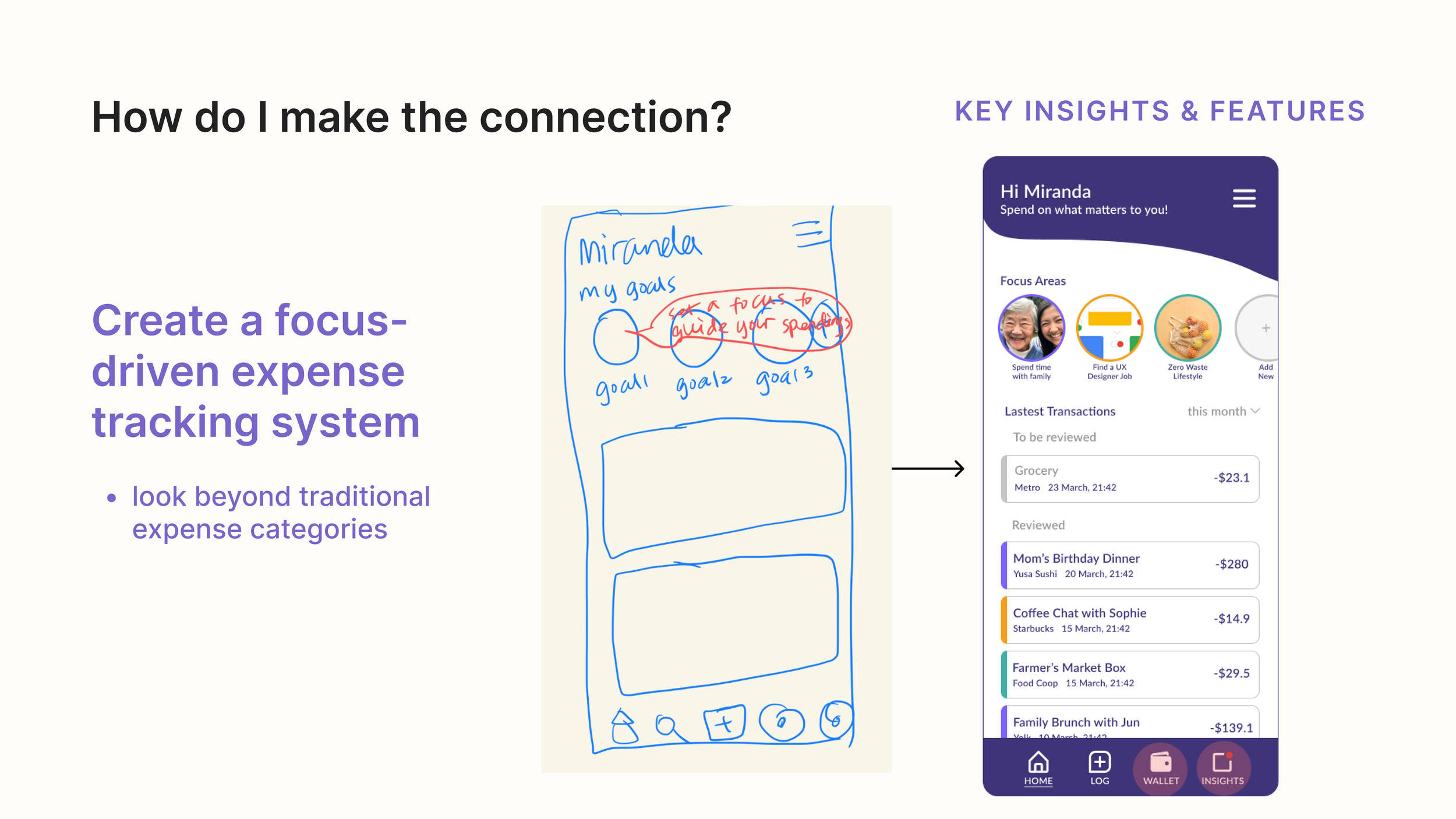
They are more likely to feel fulfilled if they know such expenses will contribute to a pursuit or an aspirational goal in life.
They feel the least fulfilled when a purchase was made because of pressure, convenience or impulse.
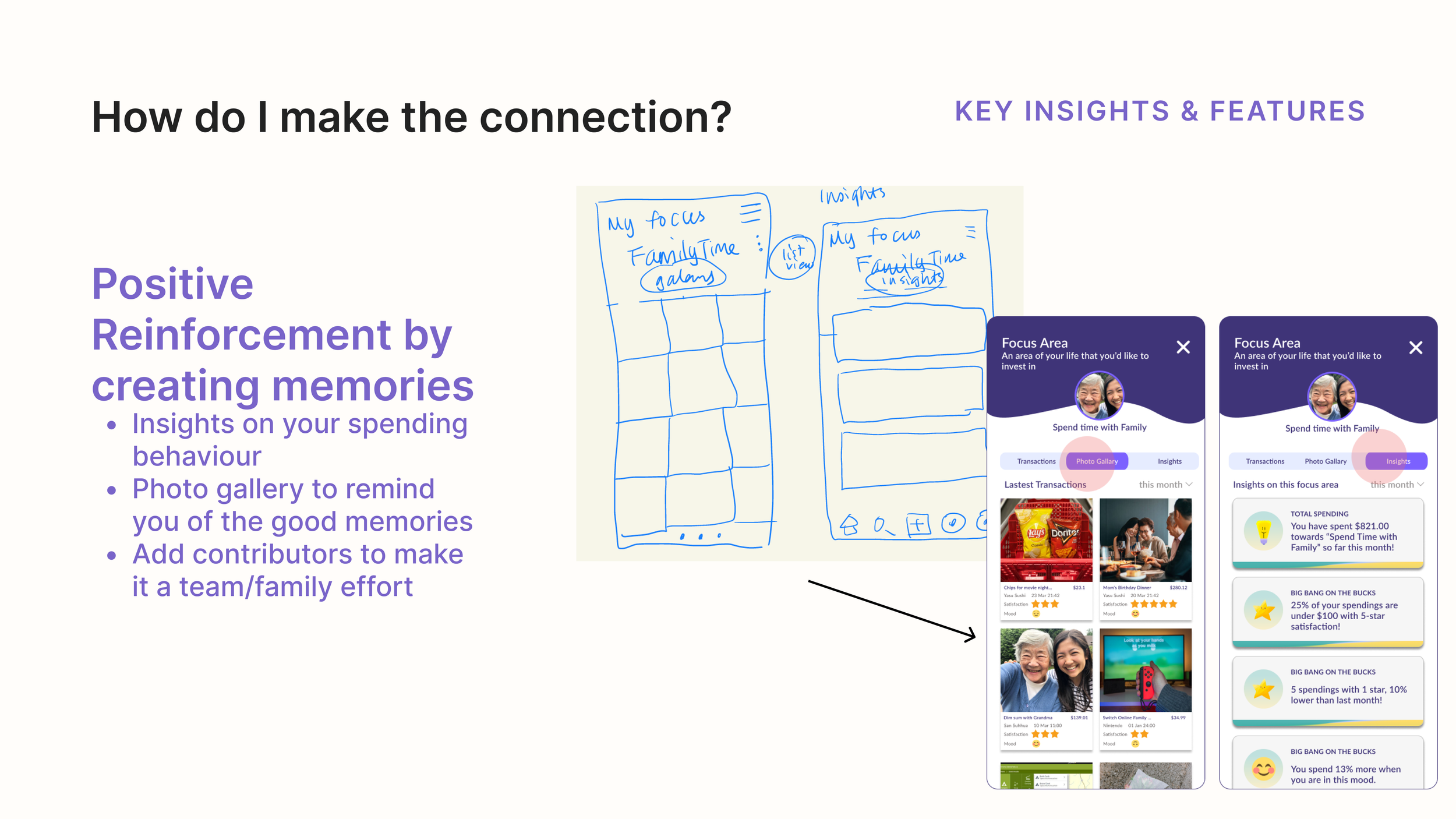
They prefer to get reminded of the good purchases they had, instead of getting accused by the bad ones.
GAP Analysis:
EXISTING SOLUTIONS HAS LITTLE TO NO FOCUS ON CONNECTING expenses WITH MEANINGFUl personal goals.
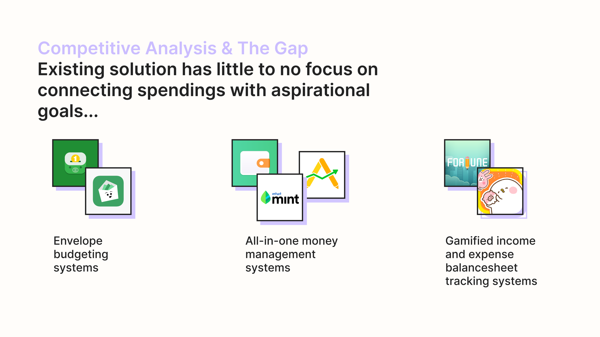
I also did a market research on seven competitors in the personal finance space, and categorized the current solutions into three major buckets:
Envelope budgeting system: suitable for users who want to stick with a precise budget per category per month.
All-in-one money management systems: suitable for users that want to have a complete picture of their overall financial situations (chequing, saving, credit, investment, assets etc.)
Gamified income and expense balance sheet tracking system: suitable for users that are new to personal finance (e.g. kids) and need to be motivated through gamification and visual elements.
Design Questions:
How might we help high-income SALARY WORKERS connect everyday EXPENSES with fulfillment?
Compared to traditional budgeting and expense tracking Apps, MONEYDAY puts less weight on the saving, budgeting or categorization. Instead, I want to create the opportunity for my users to reflect on the intention behind their spendings and reframe their relationships with money by connecting the money spent with things that brings them fulfillment in life. Based on the research, here are my strategy to help connect the dots:
✅ Timely intervention
✅ Focus-driven expense tracking system
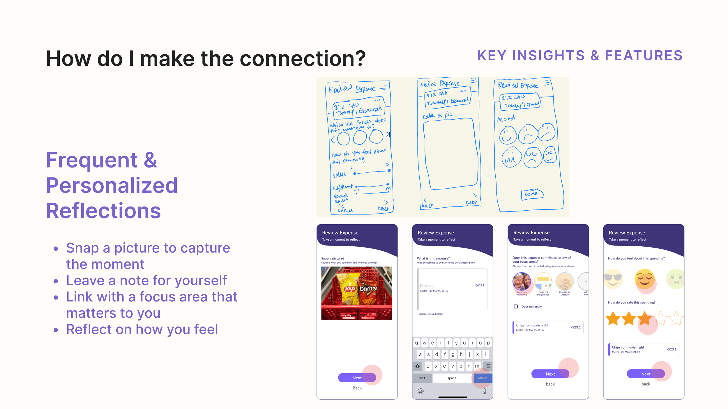
✅ Frequent and personalized reflection
✅ Positive reinforcement by creating memories
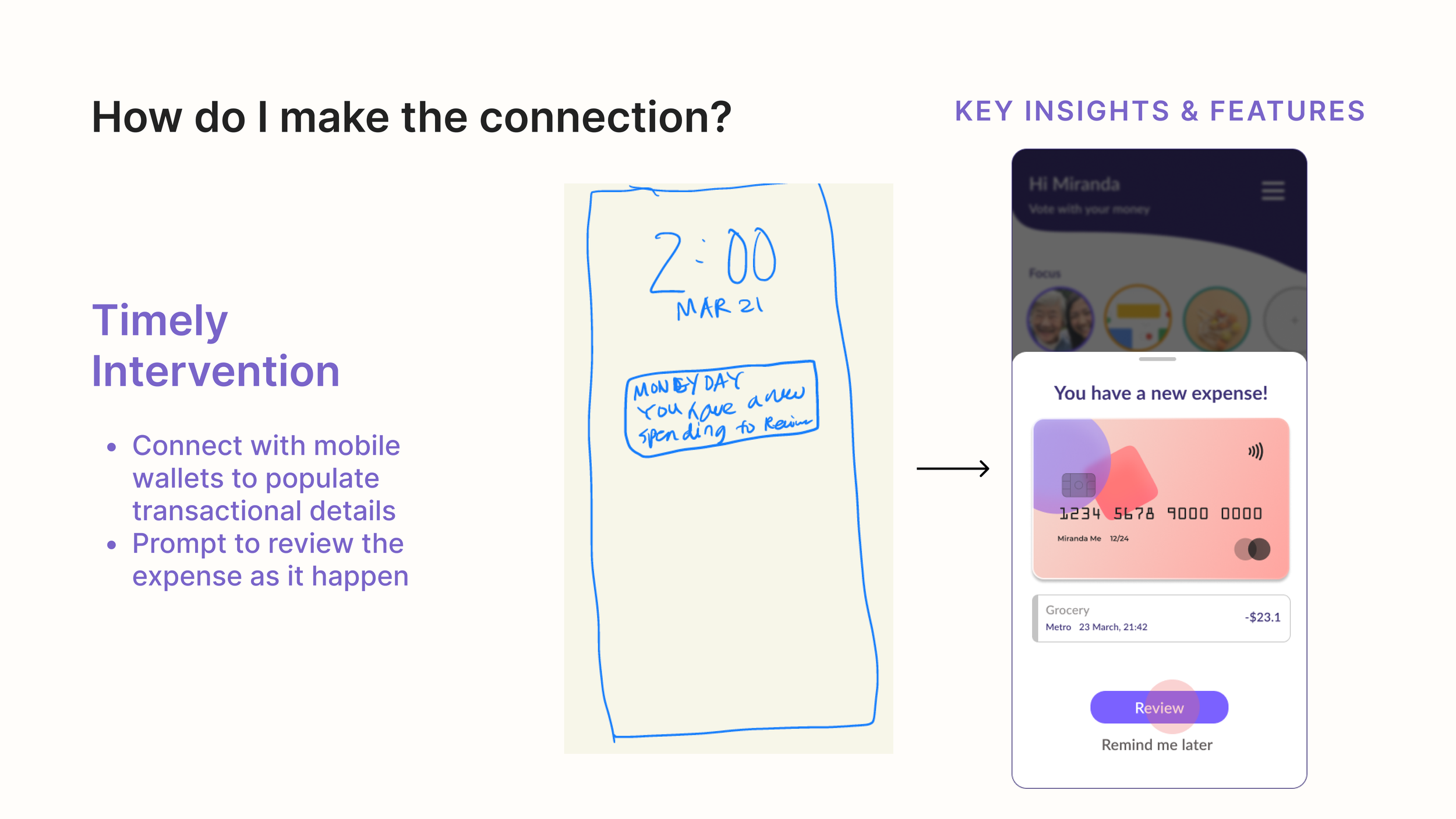
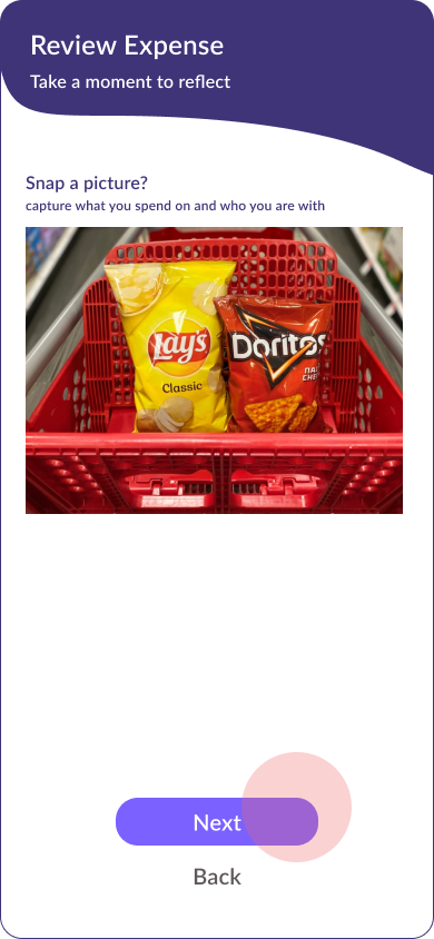
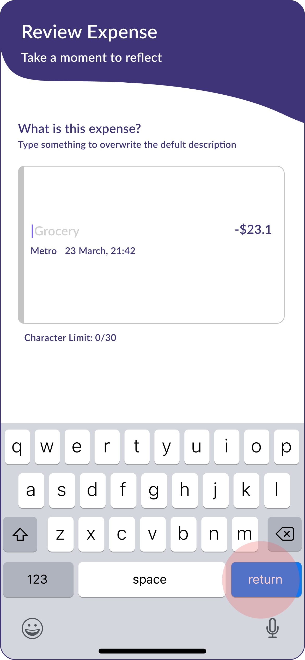
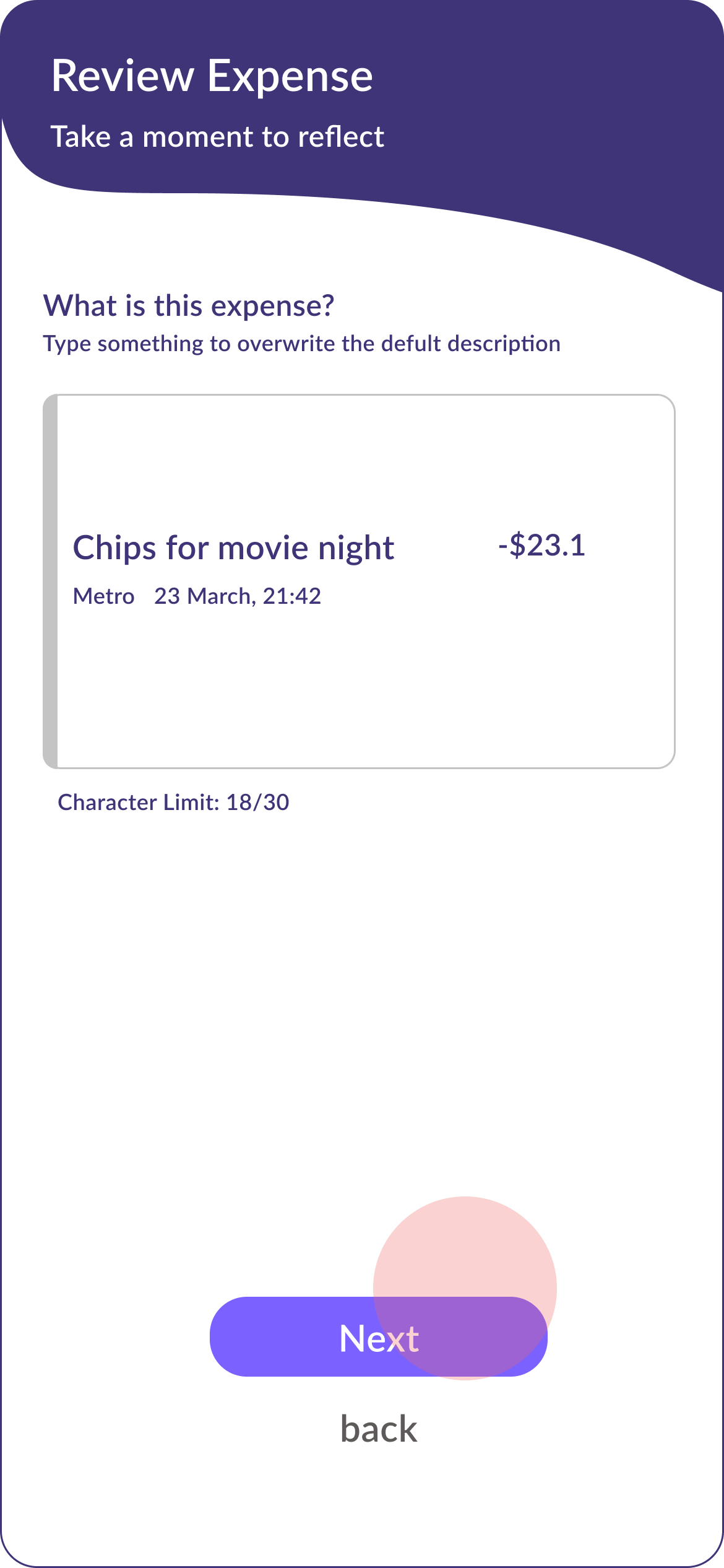
Task 1/iteration 1: review a purchase
With the insights and design strategy in mind, I narrowed down the core features into two tasks. From sketches to hi-fi prototypes, I went through three iterations and two rounds of usability testings. Here are some highlights:
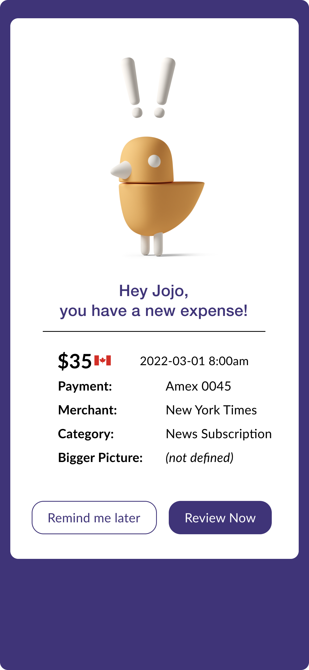
Feedback 1: INADEQUATE INFORMATION HIERARCHY
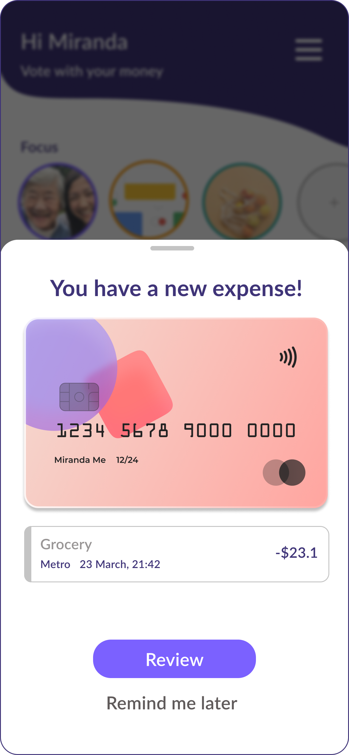
Review expense notification screen is not effective at communicating the most important information. Why there is a huge bird picture at the top? “It’s hard to skim through when the dollar amount is further from merchant and category”
Improvements:
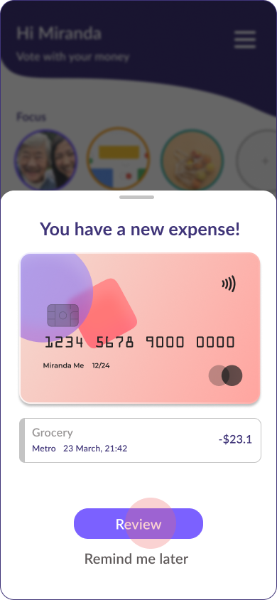
1. Changed the new expense review into a half-screen notification. So that it is easier for users to dismiss if they do not wish to review the expense now.
2. Removed images that does not add value
3. Adjusted the text hierarchy to omit information without context (e.g. “Bigger Picture”)
4. Gave more focus to the CTA button (e.g. Review).
Feedback 2: UNCLEAR LABELING
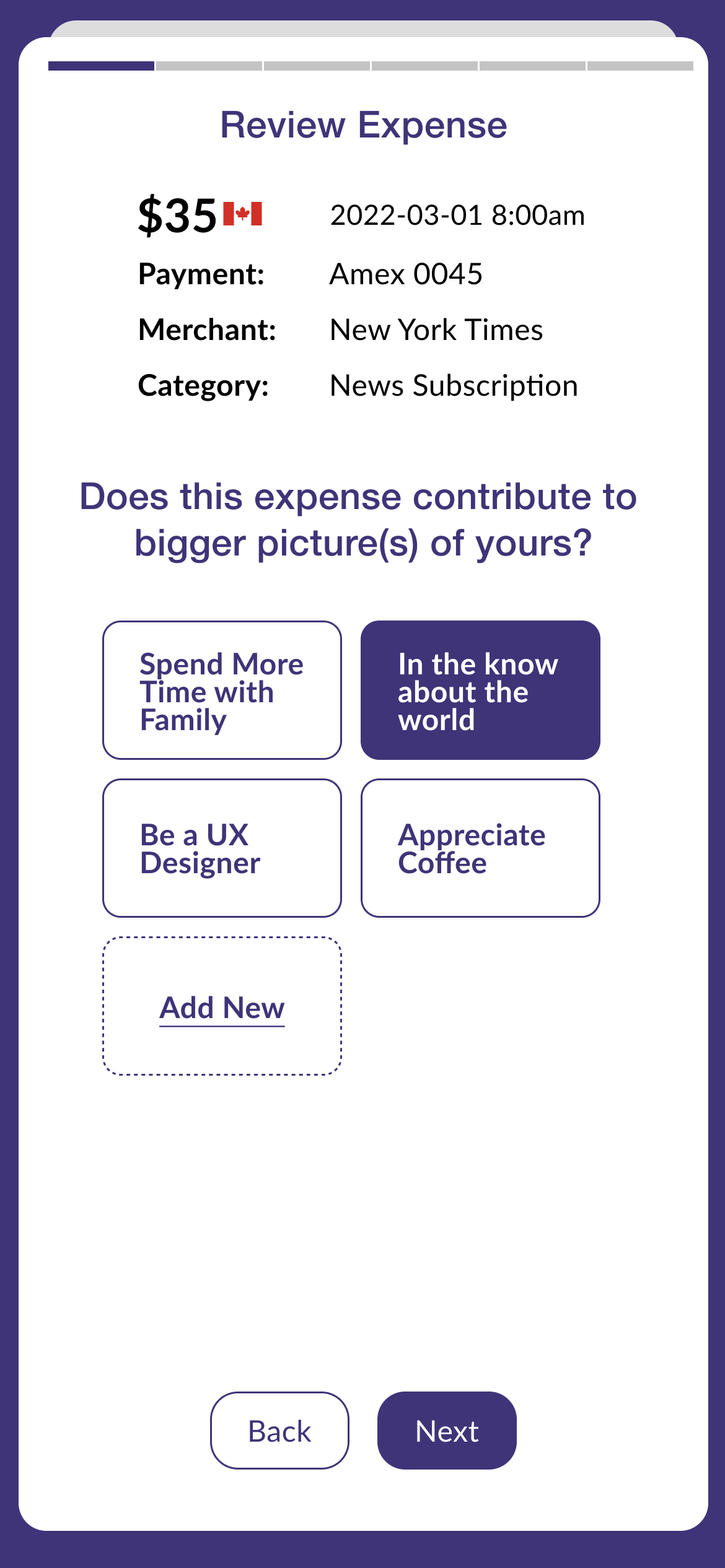
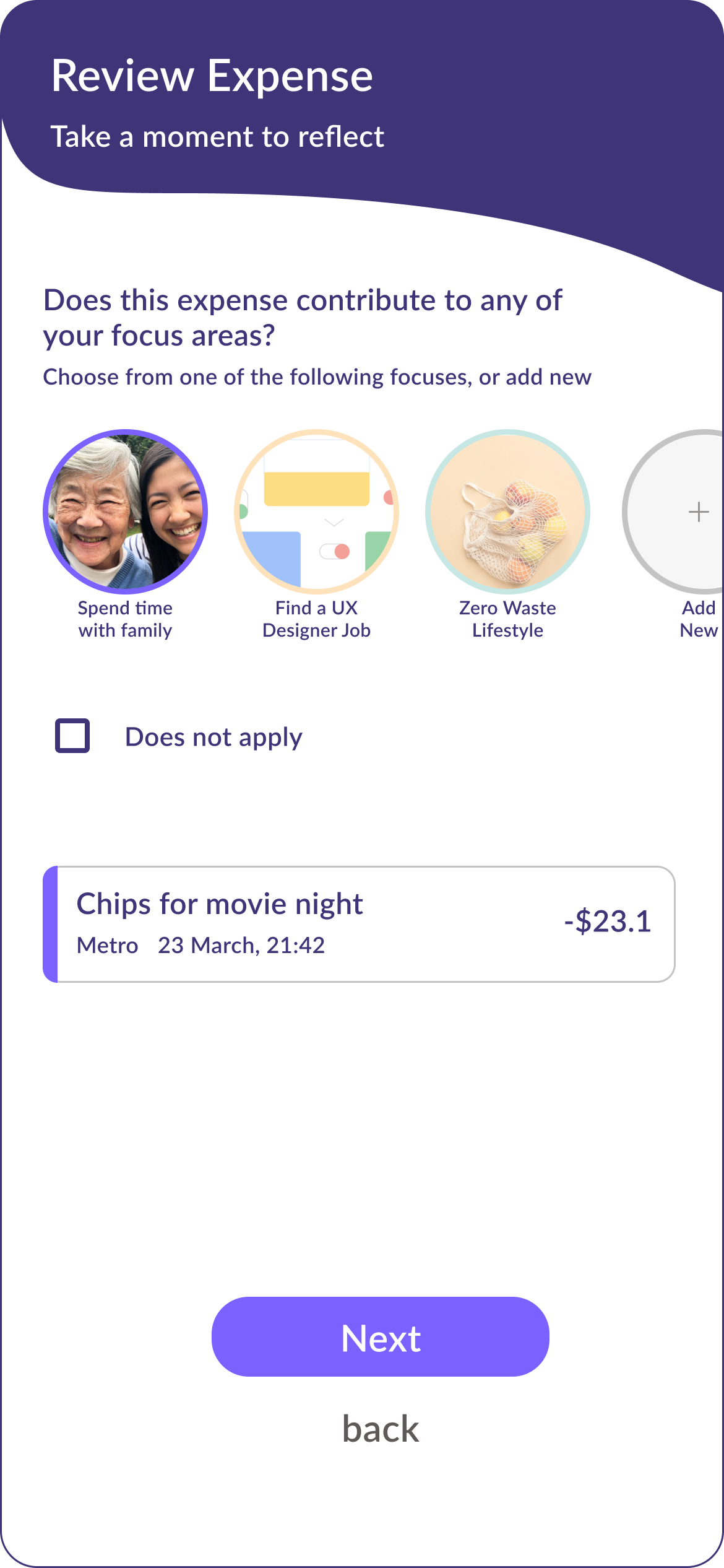
“I am not sure what is a ‘bigger picture?’ How is that different from the categories?
Improvements:
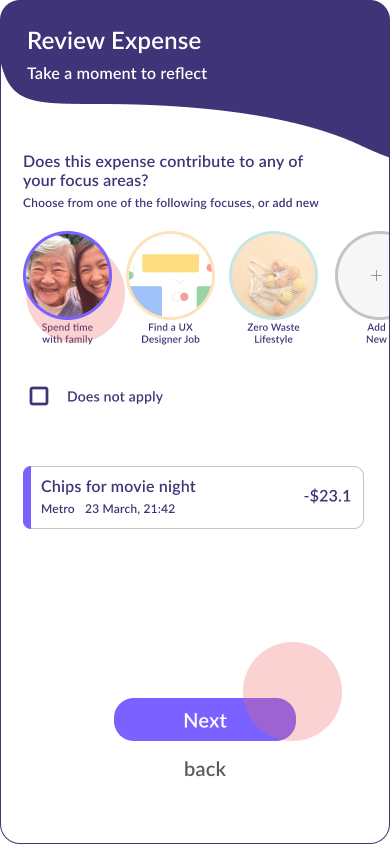
1. Renamed “Bigger Picture” with “Focus Areas”, aiming to help users identify an area of their lives that brings them fulfillment and therefore want to focus on.
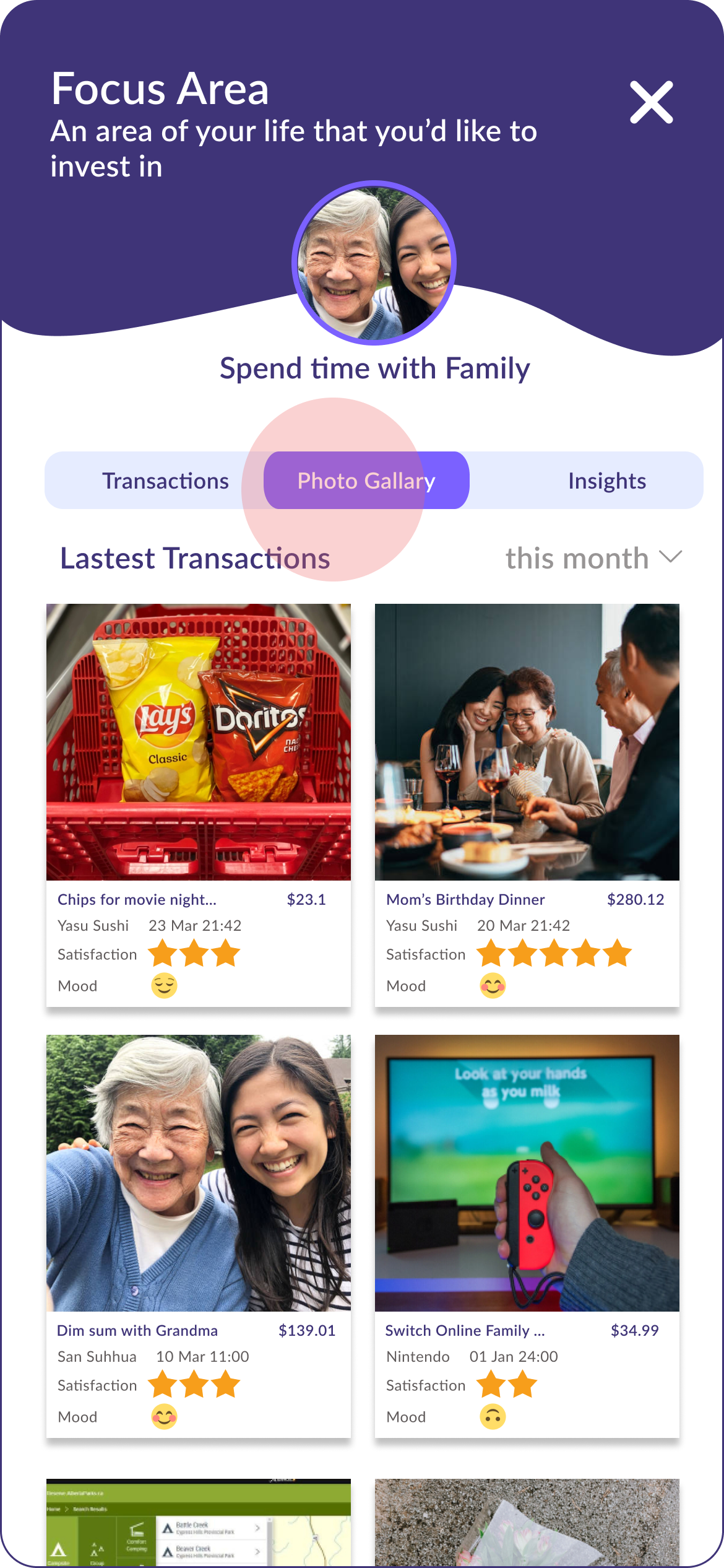
2. Allowed users to add a personalized picture and a theme colour to each focused area, so that users can quickly select one using visual memory and build a sense of momentum through repetition.
Feedback 3: Cognitive Overload
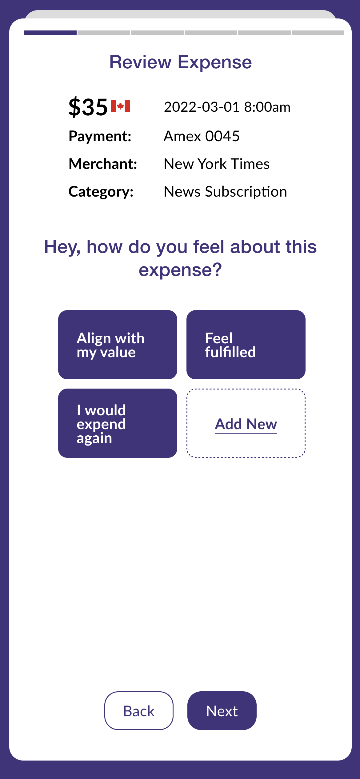
The expense information is taking too much space at the top. Users are not clear on what to do on this screen. The tags (e.g. “Align with my value” “Feel Fulfilled”) are difficult to interpret and can lead to fatigue and resistance.
Improvements:
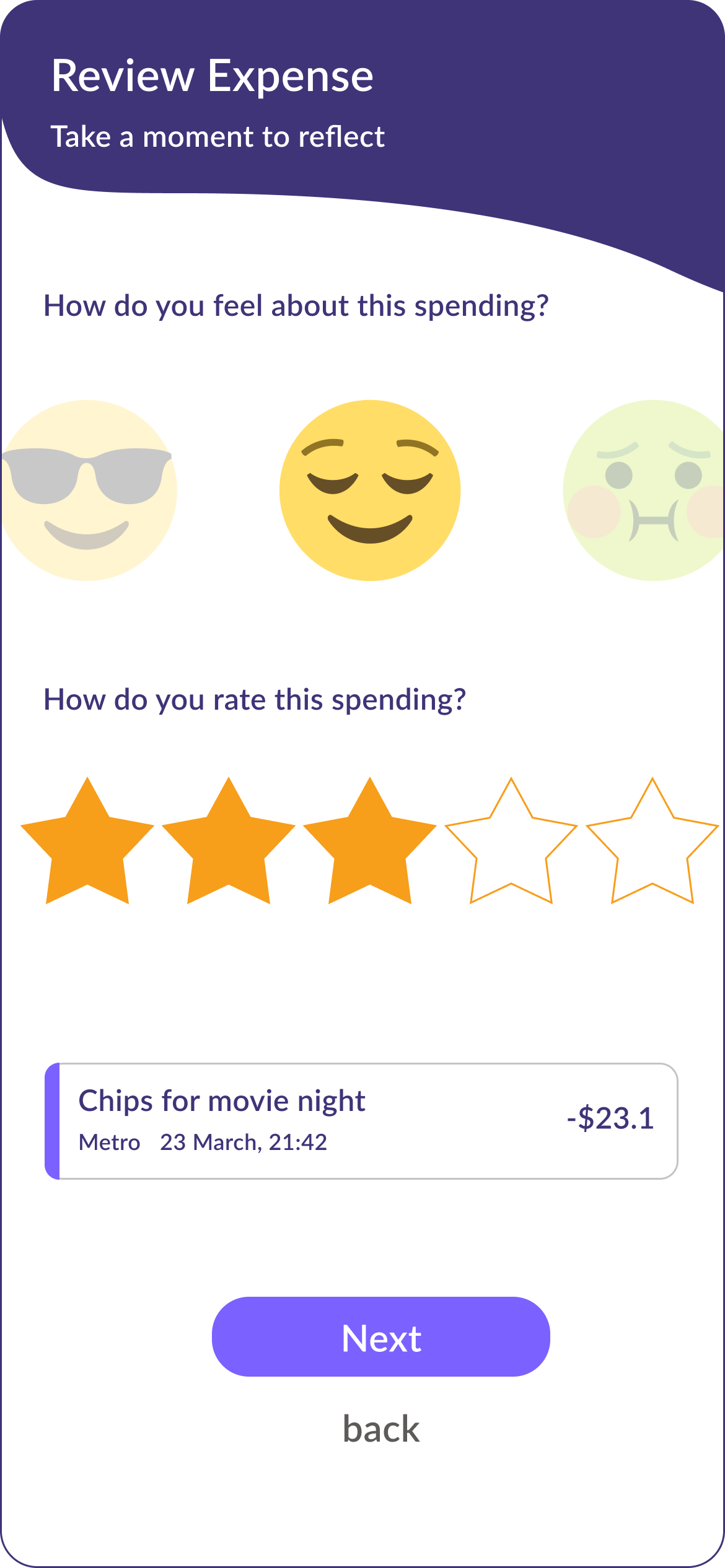
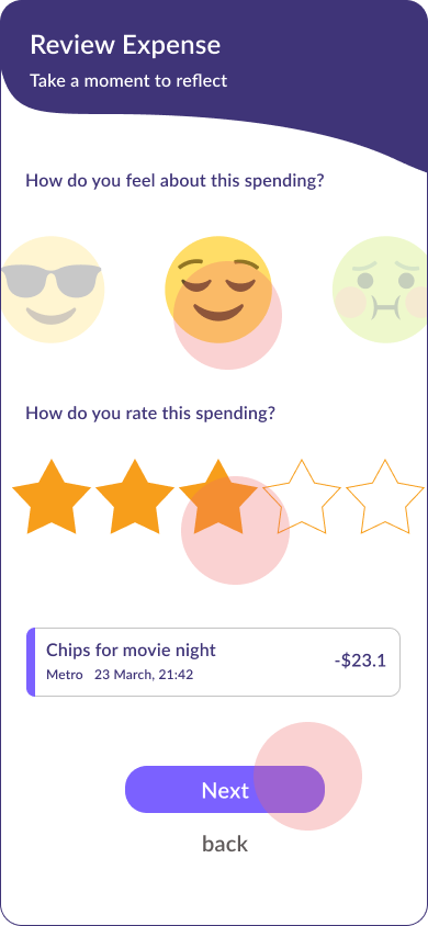
1. Brought the review CTA to the top, and placed the expense details in a card at the bottom for reference only.
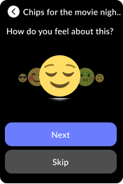
2. Changed review mechanism from text to familiar graphics, so that users can easily interpret and make decisions quickly on the go.
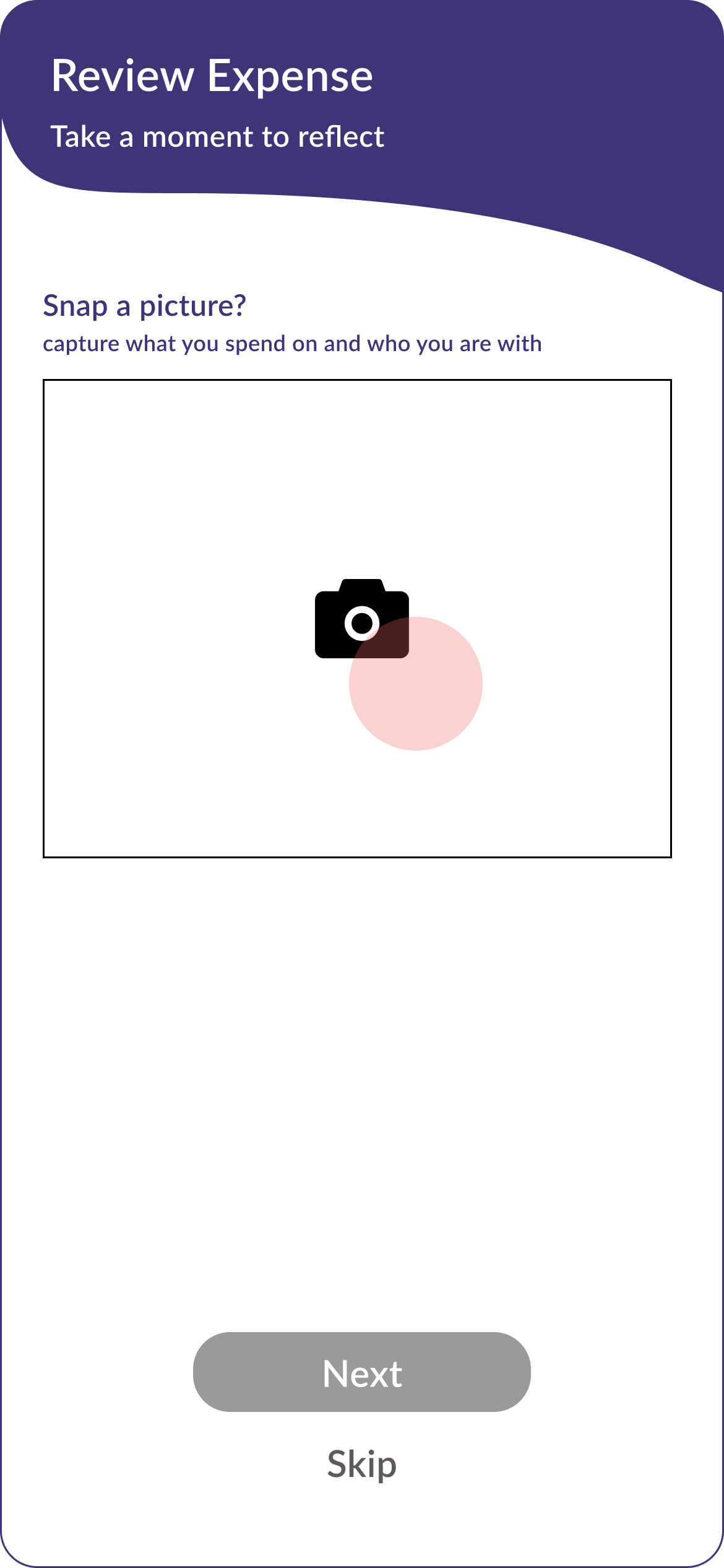
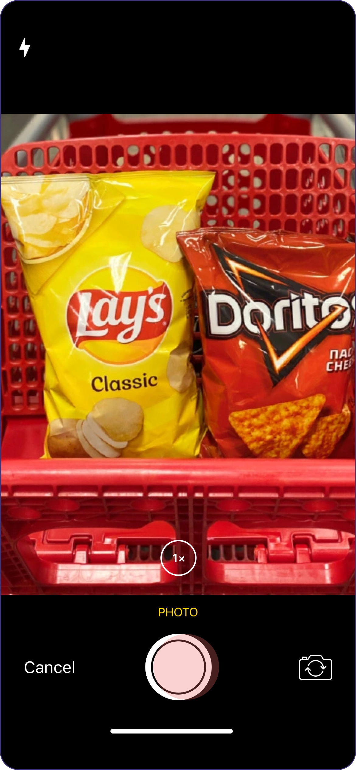
Task 1/iteration 2: review a purchase

Task 2/iteration 1: review insights
Feedback: Visual Clutter
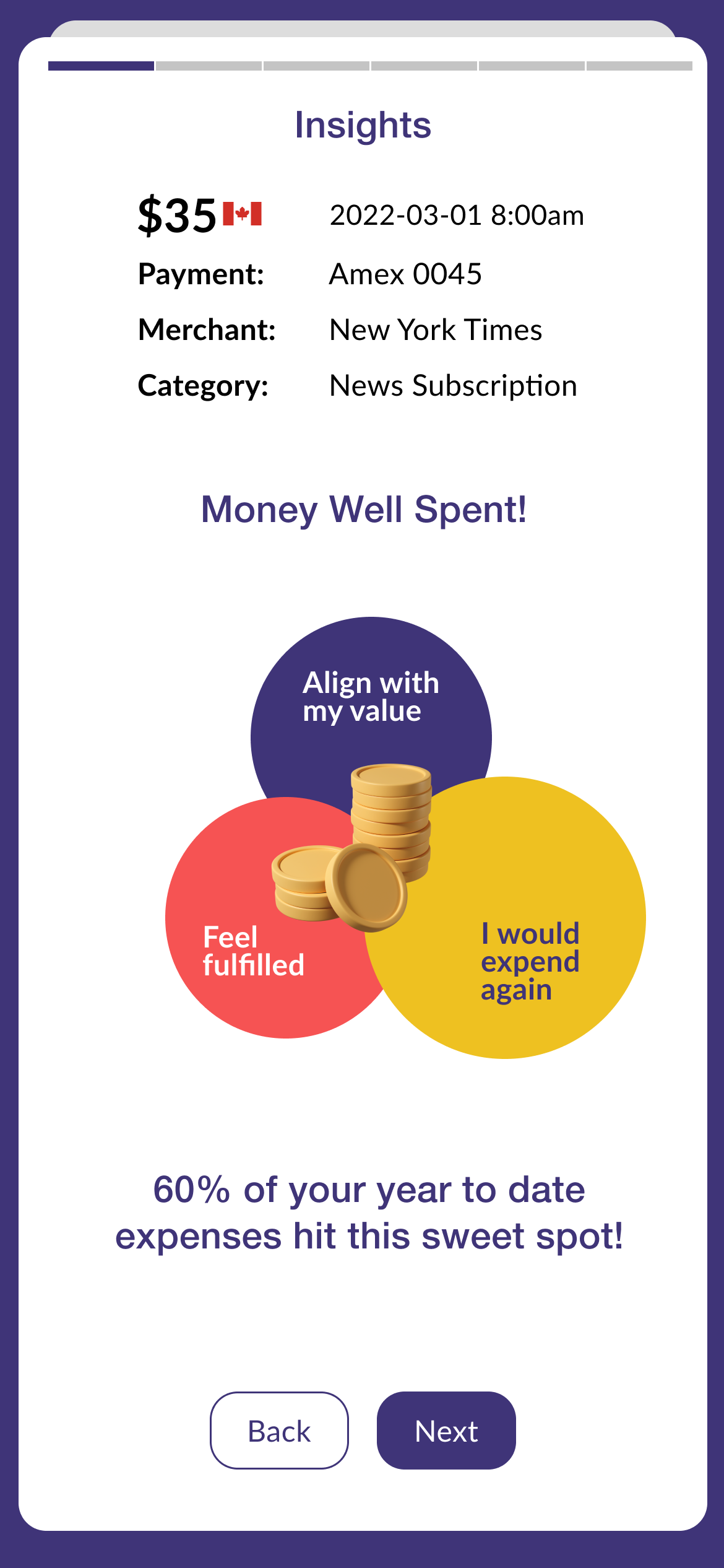
Too many things going on, not sure where to look at. The image in the middle does not align with the text underneath (e.g. 60% of your year to date expense…).
Improvements:
1. Removed images that does not add value to remove visual clutter.
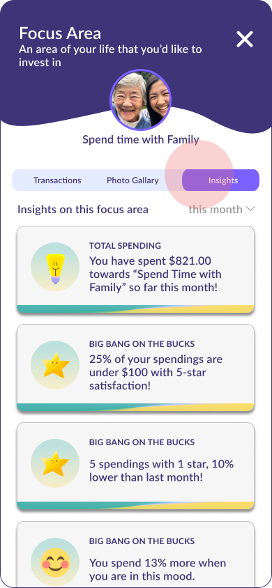
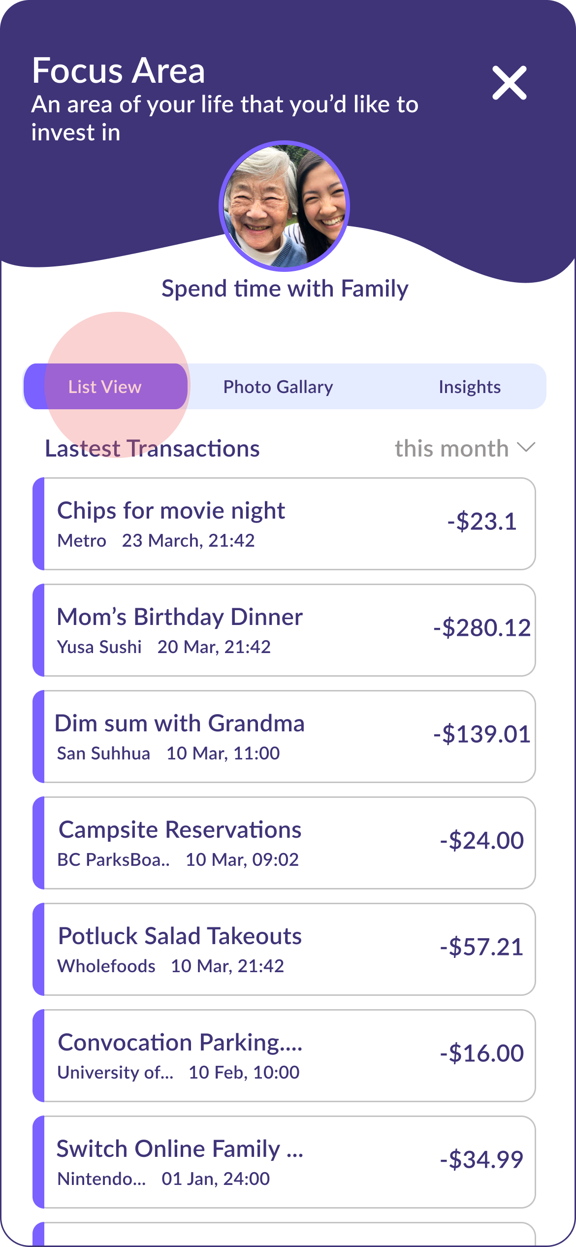
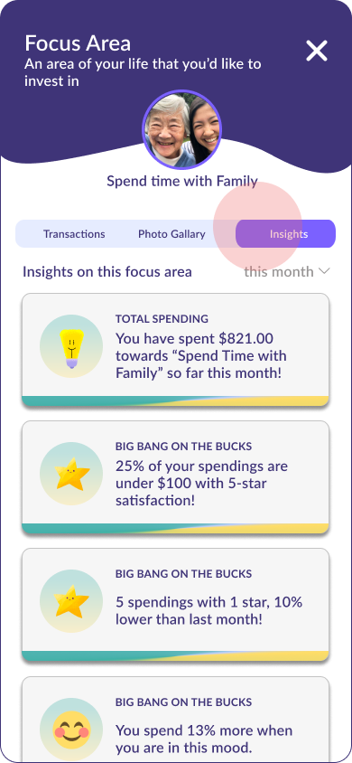
2. Grouped insights by FOCUS AREA, and display them in a list view, so that users can scan through and click on the ones they are most interested in.
3. Added a filter on insight date range.
Task 2/Iteration 2: review insights
Style Guide:
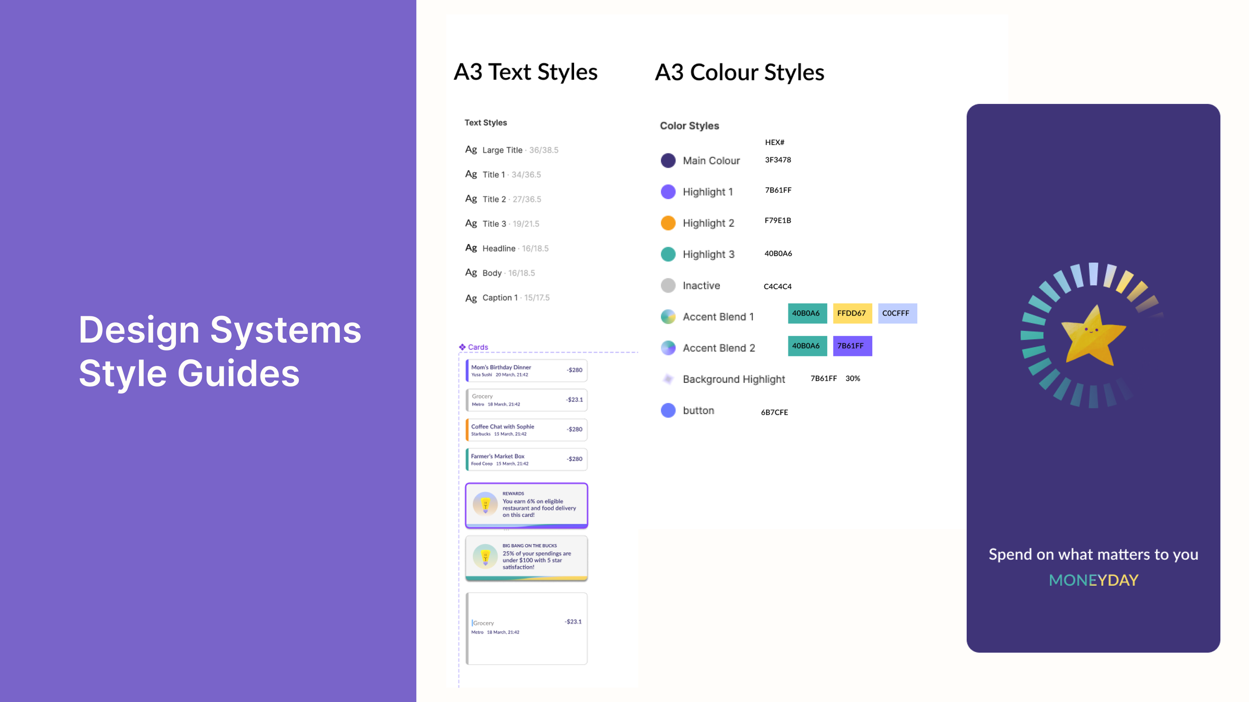
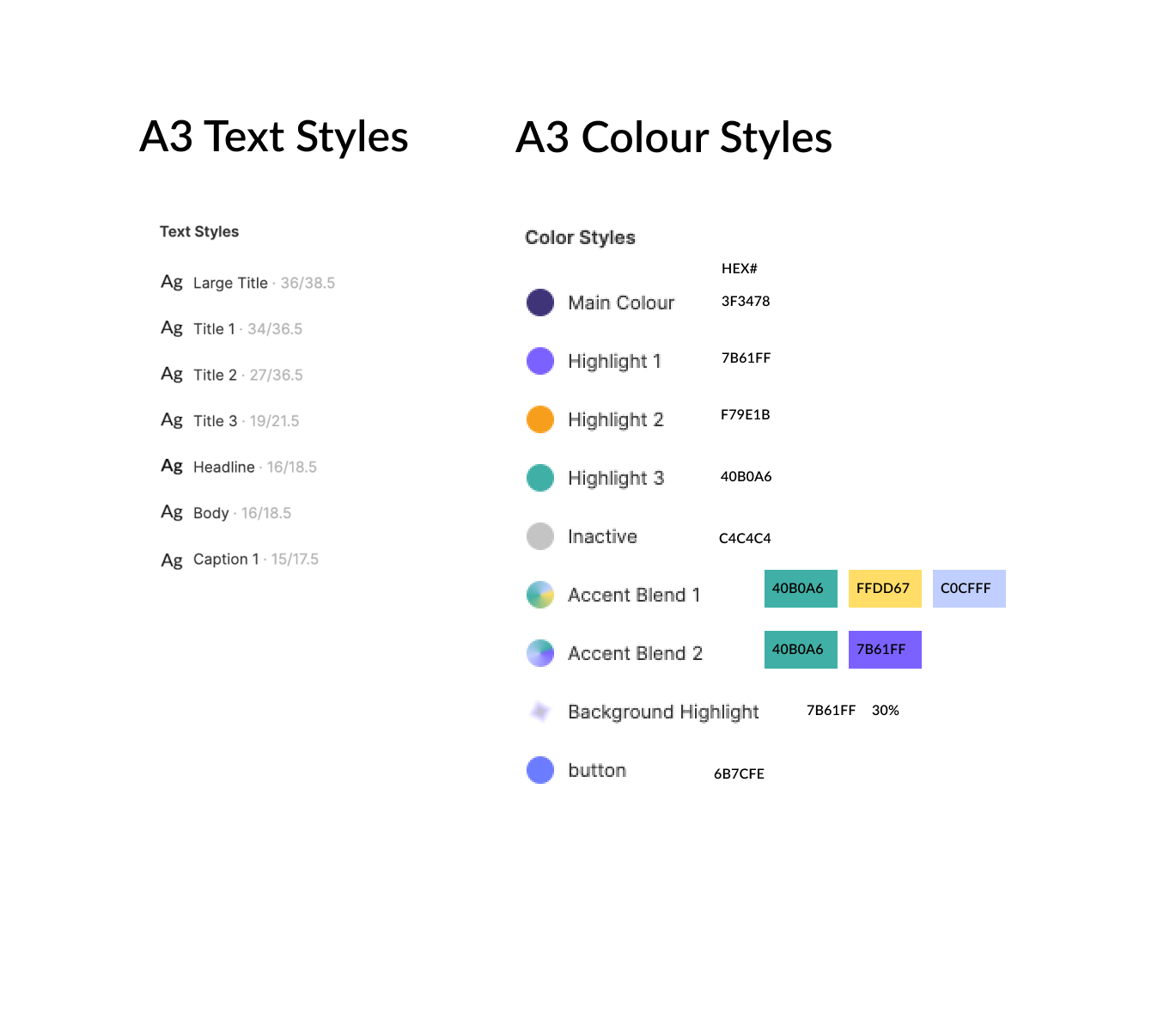
As a personal finance App, I want to build trust using a clean and coherent interface of colour and typefaces. To differentiate from a traditional banking or budgeting Apps, I steered away from the blue-green colour pallet, and used dark purple (#3F3478) and white (#FFFFFF) as my primary brand colour.
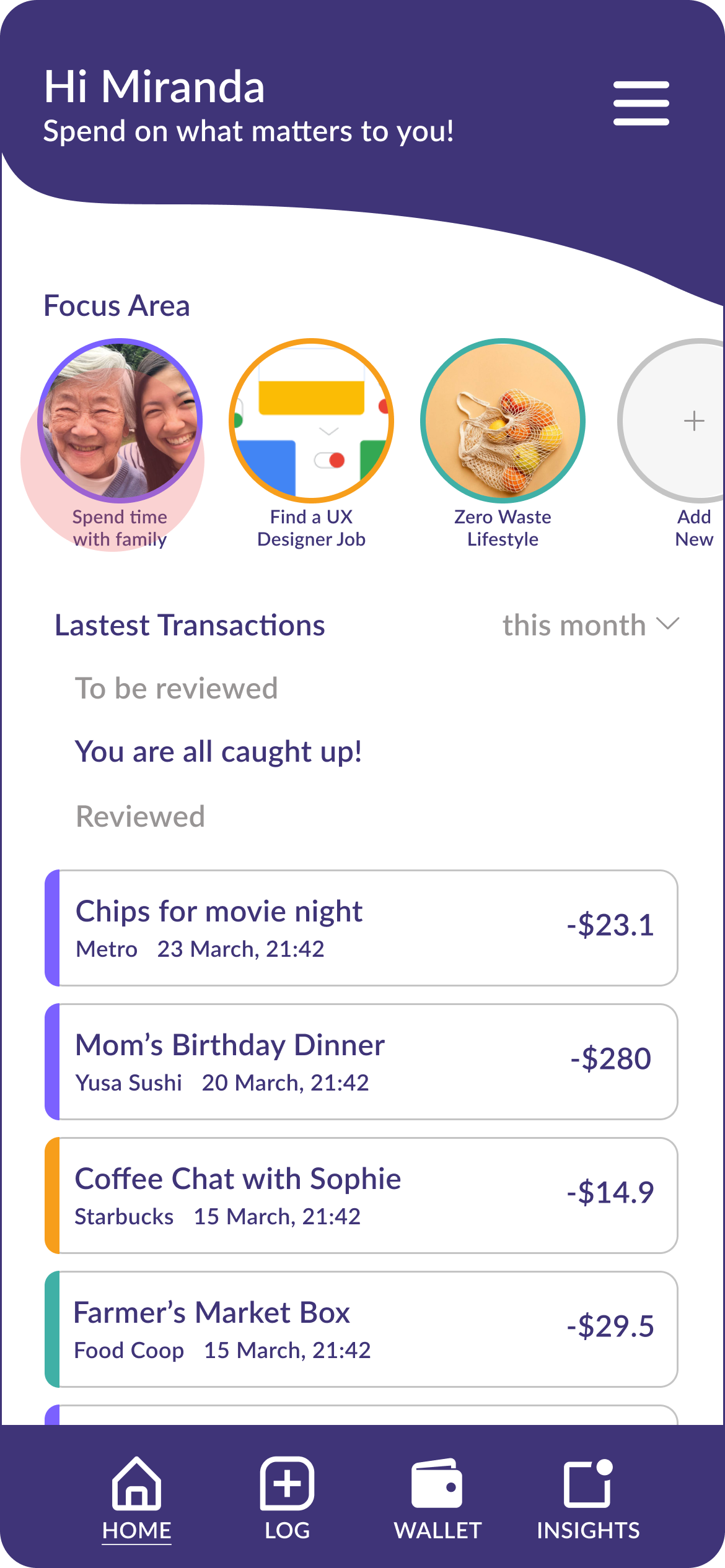
I assigned one accent colour to each FOCUS AREA. For instance, all transactions related to “Spend time with family” will carry the same accent colour as the outline of focus area circle.
I used circles, rounded cornered cards, emojis and san-serif typefaces as a friendly token to reduce the intimidation people may feel about personal finance. And used vibrant accent colours to set a positive tone.
Bonus Iteration: apple watch
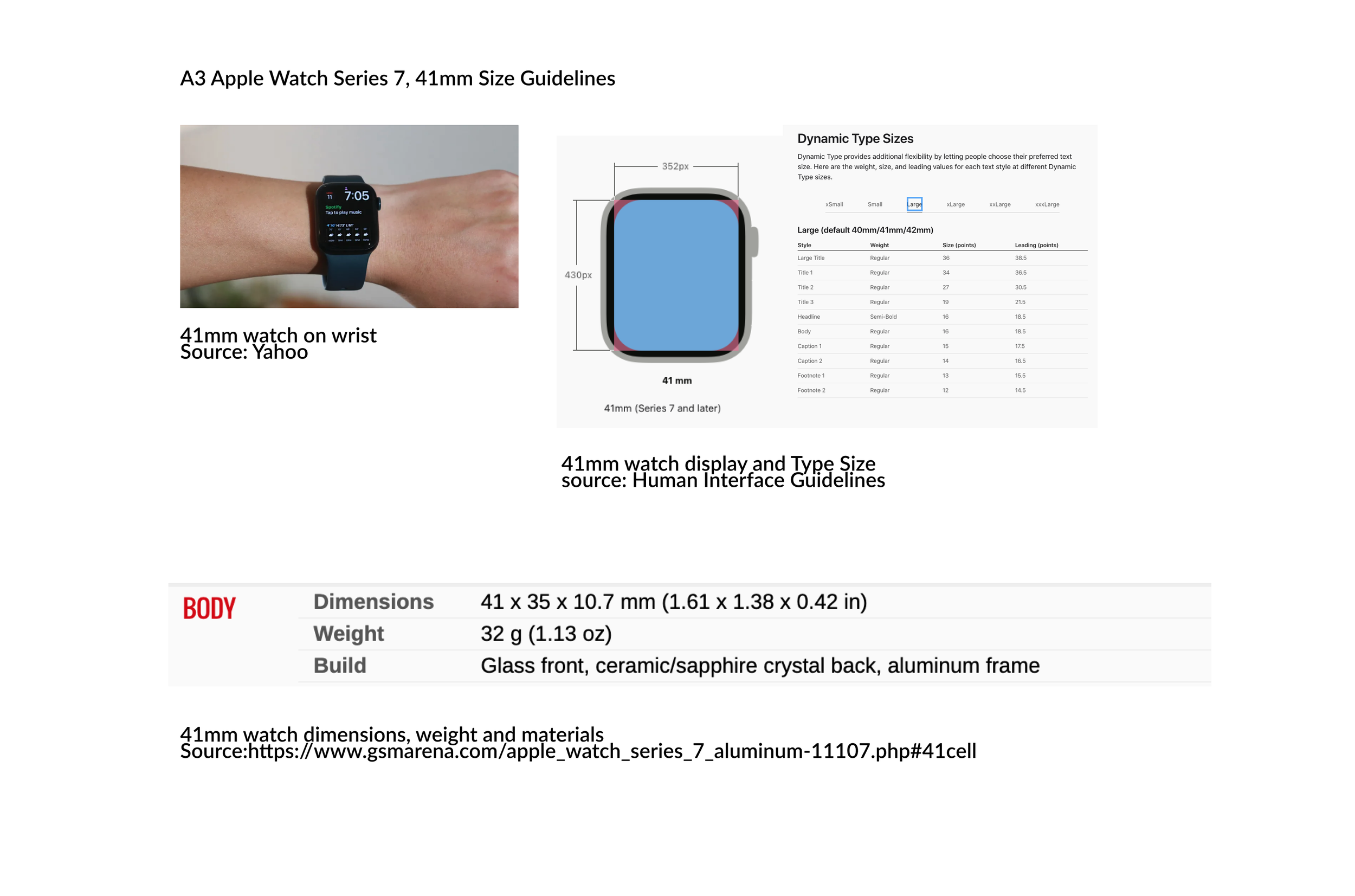
When designing for Apple watch, I came across a lot more restrictions, such as significantly smaller screen size, unconventional interaction types, and black background with rigid design guidelines.
To make the experience consistent, I did not change the colour and branding despite fine tuning the opacity to meet the contrast requirement. I followed the Human Interface guidelines closely to set margin, text styles and layout.
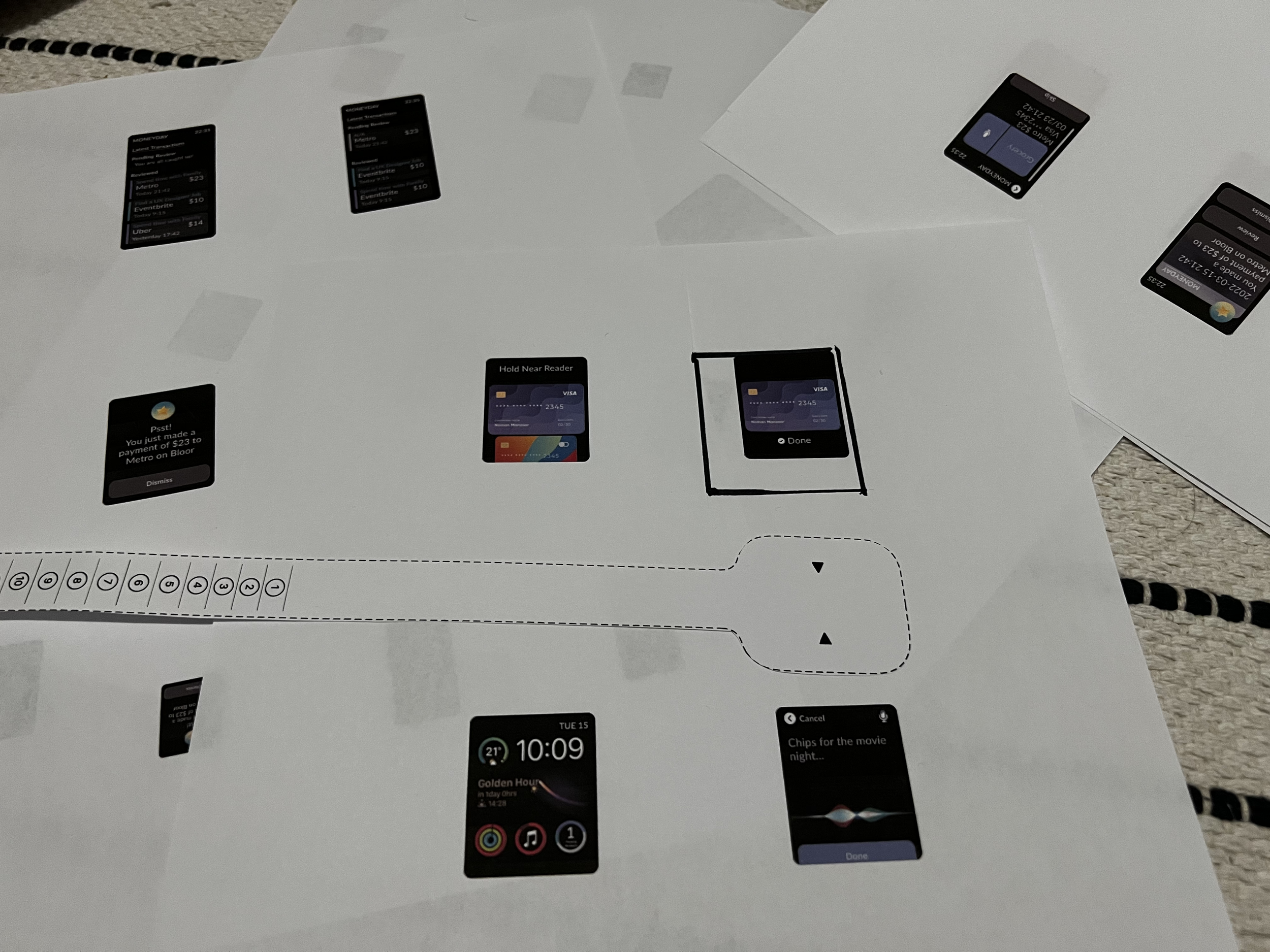
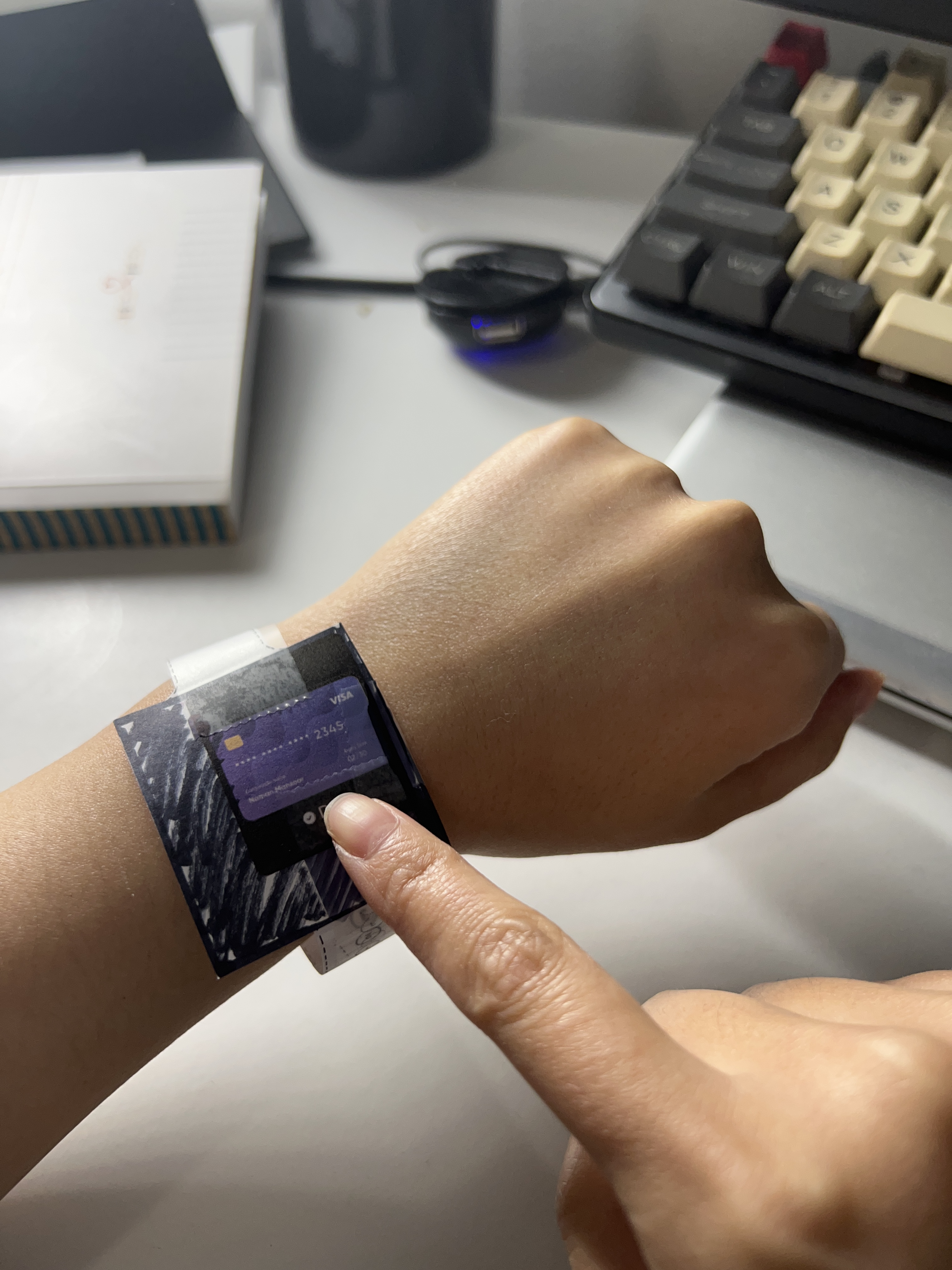
To enhance user experience on the watch, I also experimented with new ways to interact with the App by incorporating a lower wrist position to dismiss notifications, using voice input instead of keyboards, using the digital crown to scroll instead of swiping on the screen.
Task 1: review an expense
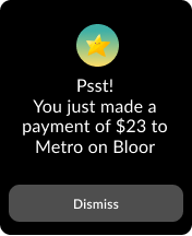
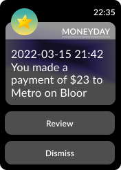
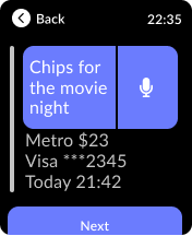
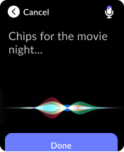
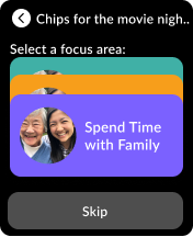
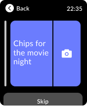
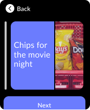
I redesigned the task for users to review expenses on an Apple watch, and made some adjustments that to consider the contexts of a smartwatch interaction:
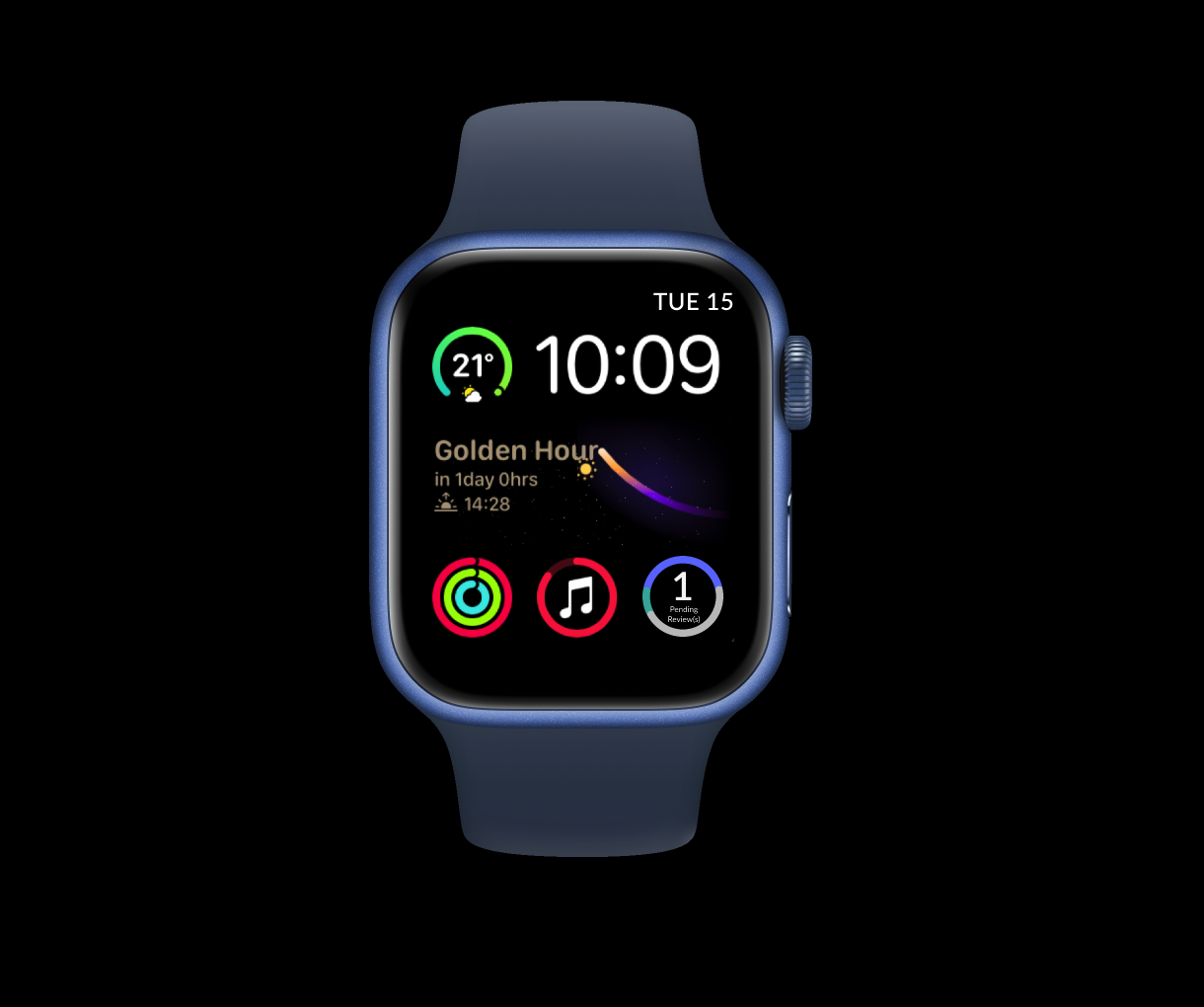
Public/Privacy: Considering the sensitivity of managing personal finance, I designed the watch interface with both short and long notifications and a complication bubble. Users have the flexibility to quickly dismiss the request for review, but also have plenty of options to retrieve the request from watch face and notification centre without losing track of their spendings.
Voice Input: Replaced the keyboard input with voice input given the absence of a keyboard.
Situational: Screens on Apple watches are a lot smaller, and cannot carry out the full affordance of an App. Tailoring to this use case, I eliminated a few functions that require longer attention and more user input (such as viewing spending insights, adding new focus area, viewing focus area photo galleries etc.) Ideally my users will quickly review their expenses as it occurs and move on with their days. If they want to see more details, they can log into the App on their phone.


Key Takeaways:
Leverage established design system guidelines!
Stay organized with my design files.
If I were to do this project again, I would conduct more user research and usability testing.