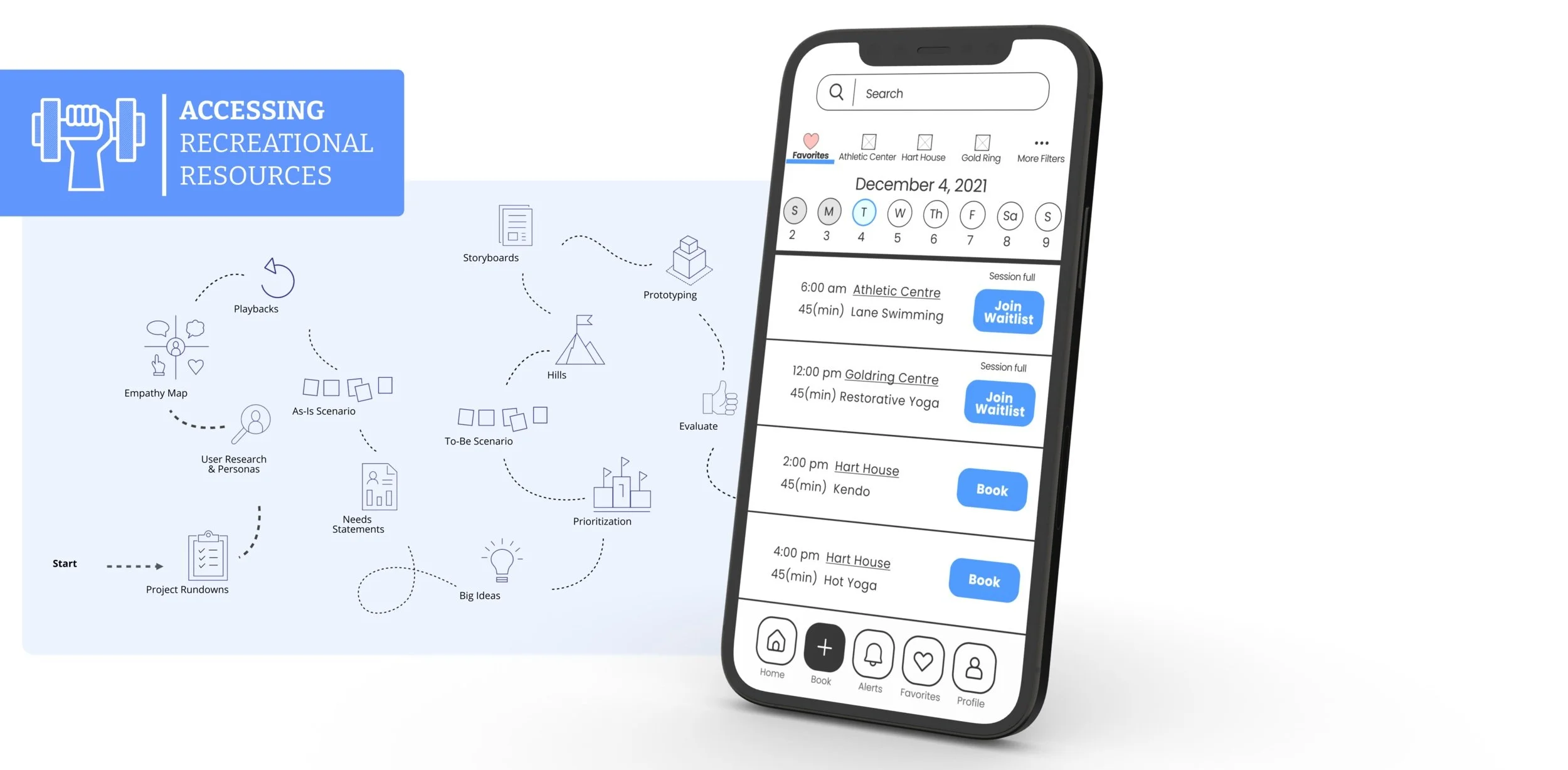
University of Toronto Sports & Recreations App
An App to help students discover, access and engage in recreational activities across different facilities at the University of Toronto St. George campus.
MY ROLE:
User Research
Storyboarding
UI/UX Design
TEAM:
Amy L
Keti D
Shahroz Z
Stefan L
TOOLS:
Figma
Miro
TIMELINE:
12 Weeks
2021
Problem space:
Problem Statement: Based on an online survey the team conducted on the University of Toronto St. George campus, 70% of the students have issues accessing recreational facilities on campus. Common barriers include difficulty finding information, inadequate reservation systems and lack of assistance.
Design Question: How might we remove barriers for students to access recreational facilities at the University of Toronto?
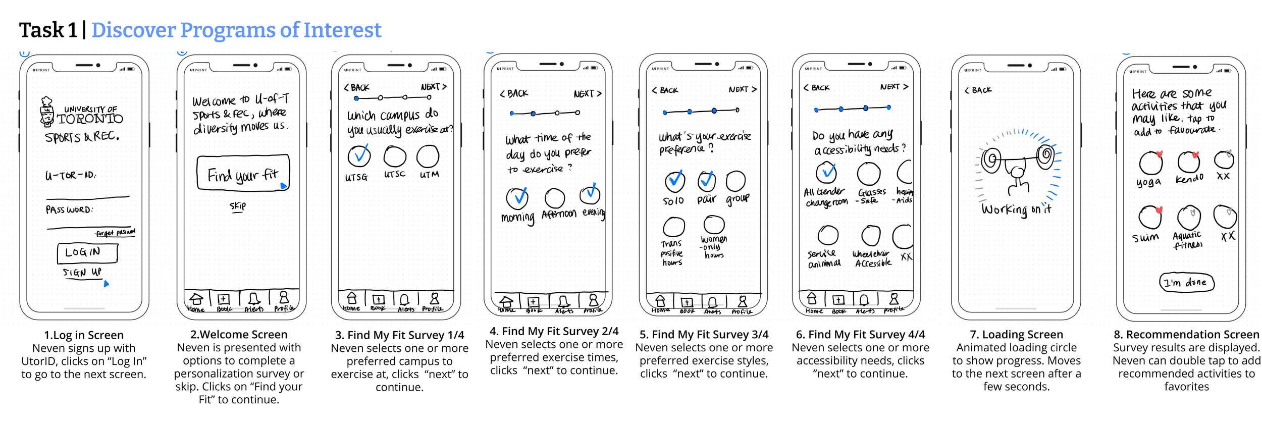
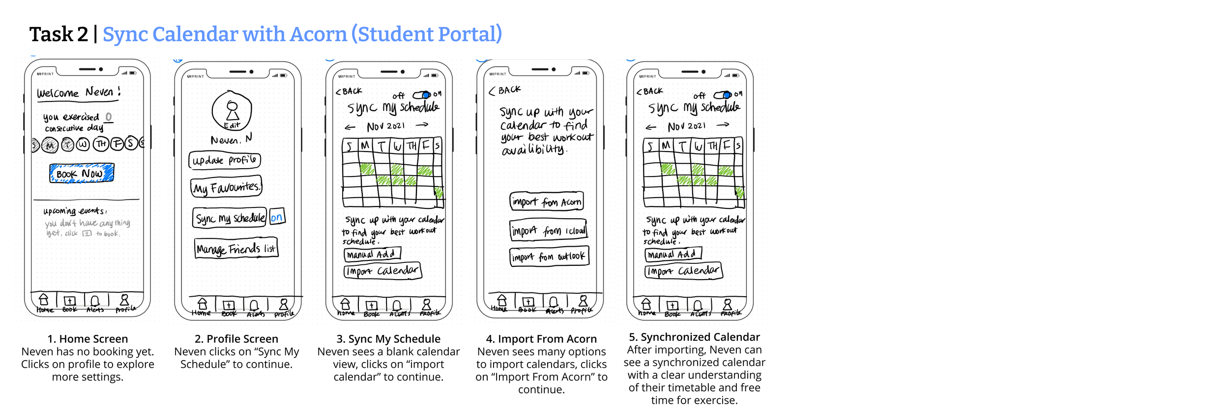
As a group, we used a user-centred design process to explore this problem space and built a Mobile App with three tasks to address the pain points discovered through our user research.
Empathize with the users:
To empathize with the users, the team collected 30 survey results and conducted ten semi-structured interviews with representative students regarding their experience at recreational facilities (Athletic Centre, The Hart House, the Goldring centre) on campus.
Out of the 30 surveys, 70% of the participants expressed challenges making reservations at these facilities. One of the interviewees stated: “With my heavy course load, it is impossible to plan to work out two days ahead at an exact hour.”
The team plotted all interview data points collected from the user research on an empathy map and identified the following three areas of pain points:
😵💫 Scattered information lead to low discoverability about recreational offerings on campus
😤 The absence of a waiting list approach leads to competitive booking
😳 Intimidate gym culture leads to a lack of motivation
Define User Goals:
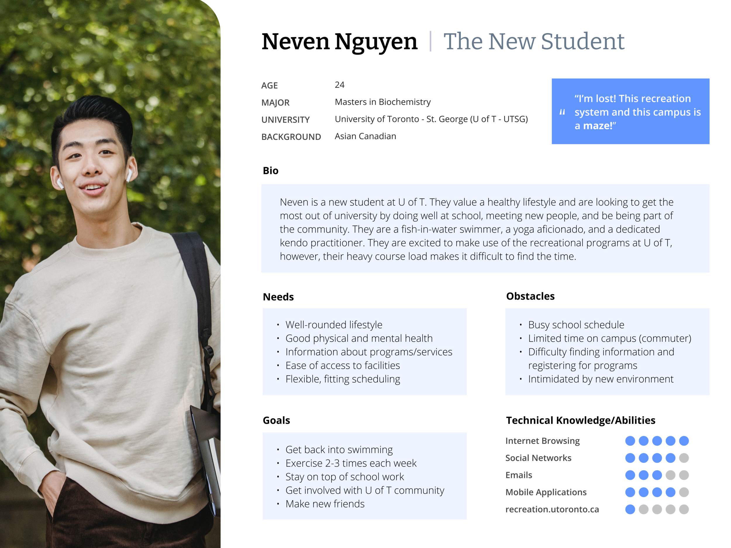
To help the team think in the shoes of our users, we created a persona. Meet Neven, the New Student (they/them) at UofT.
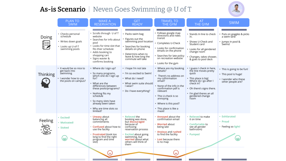
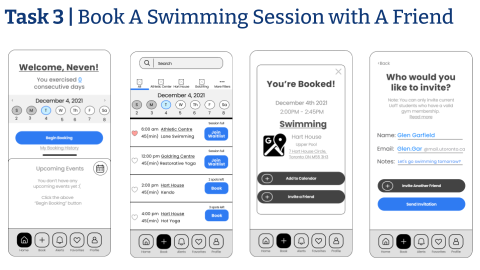
After mapping out Neven's journey to book a swimming session at the Hart House on campus, the team defined three goals for our users:
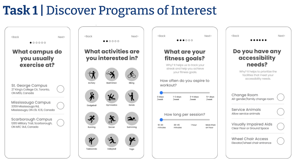
✅ Discover recreational programs by interest
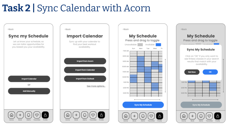
✅ Reserve a timeslot that fits the hectic student schedule
✅ Feel comfortable and welcomed at recreational facilities
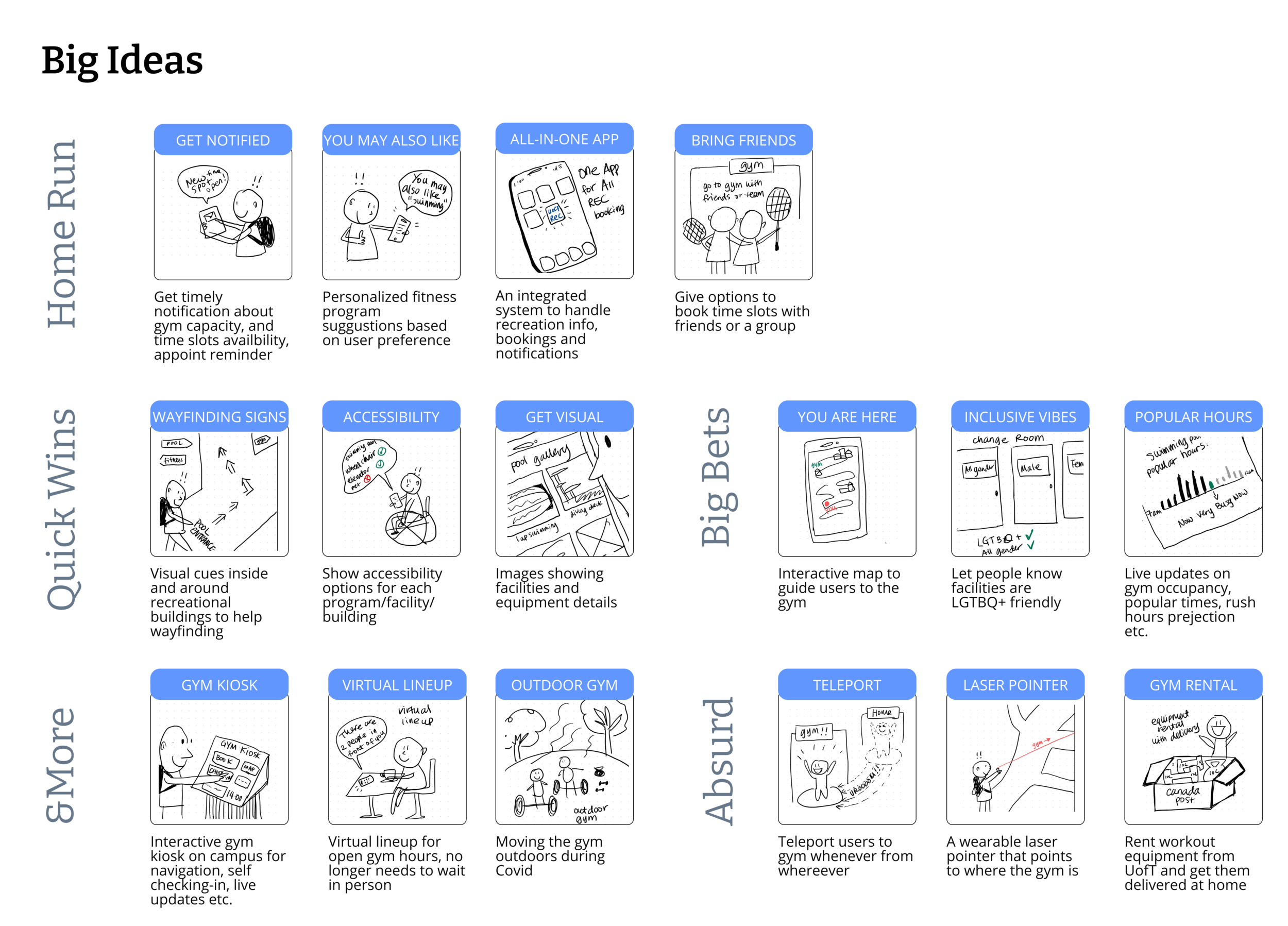
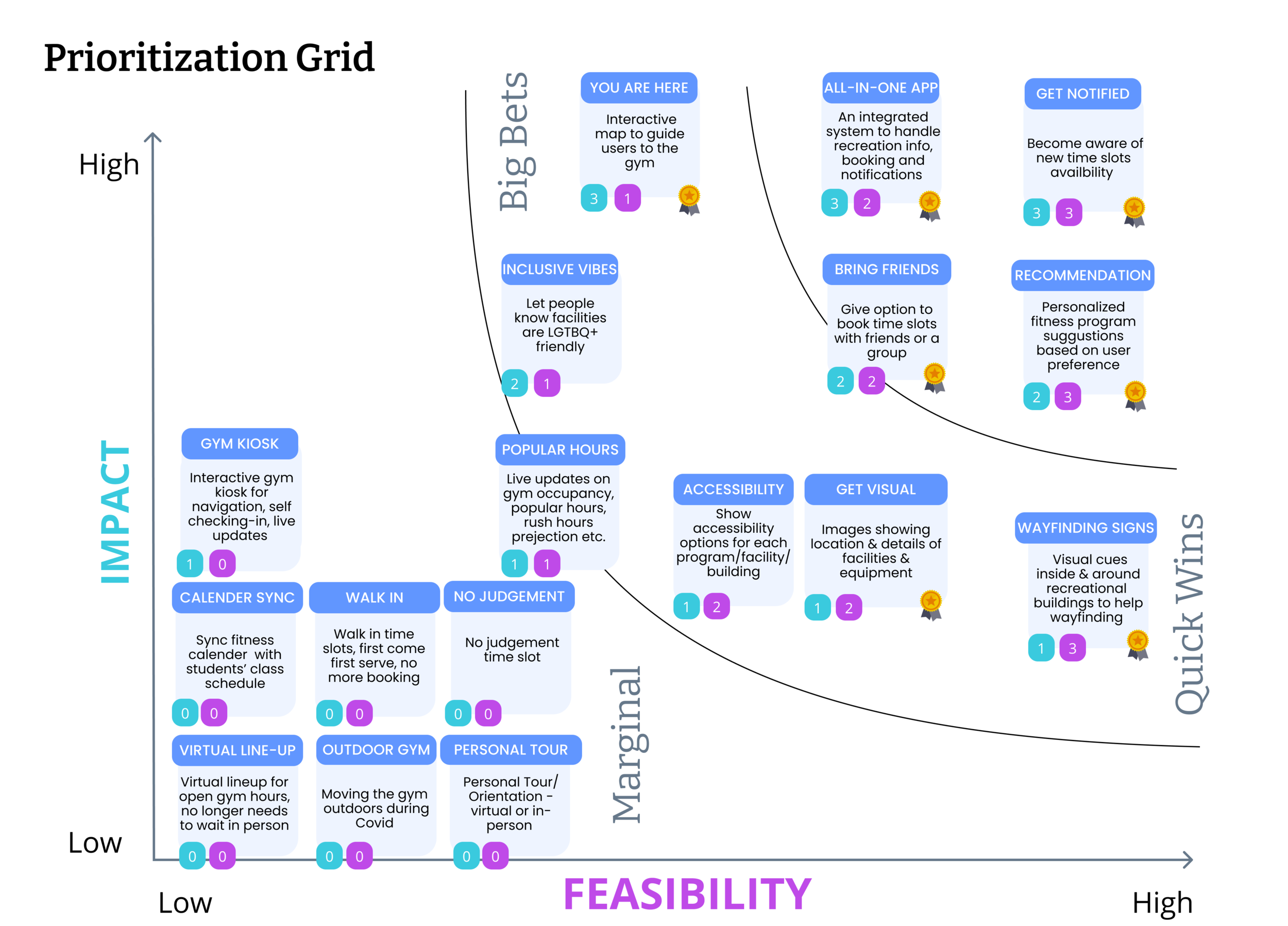
ideation time!
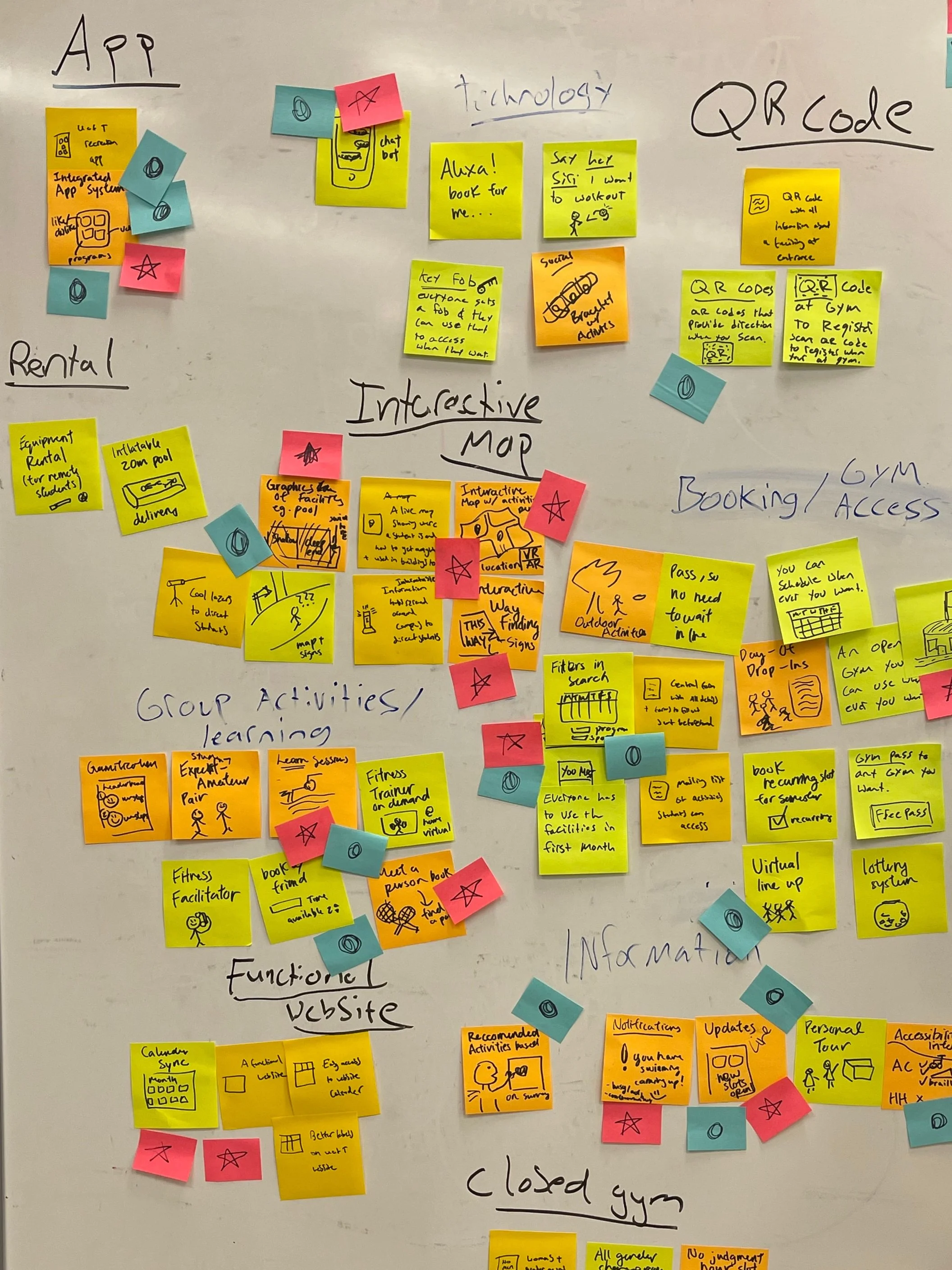
Brainstorm -> Storyboarding -> Prorotization
The team organized all ideas into themes, sketched out some key features and voted them against impact and feasibility. These steps helped us consolidate ideas to a manageable amount for the next steps.
Iteration 1: Low-Fidelity Prototyping
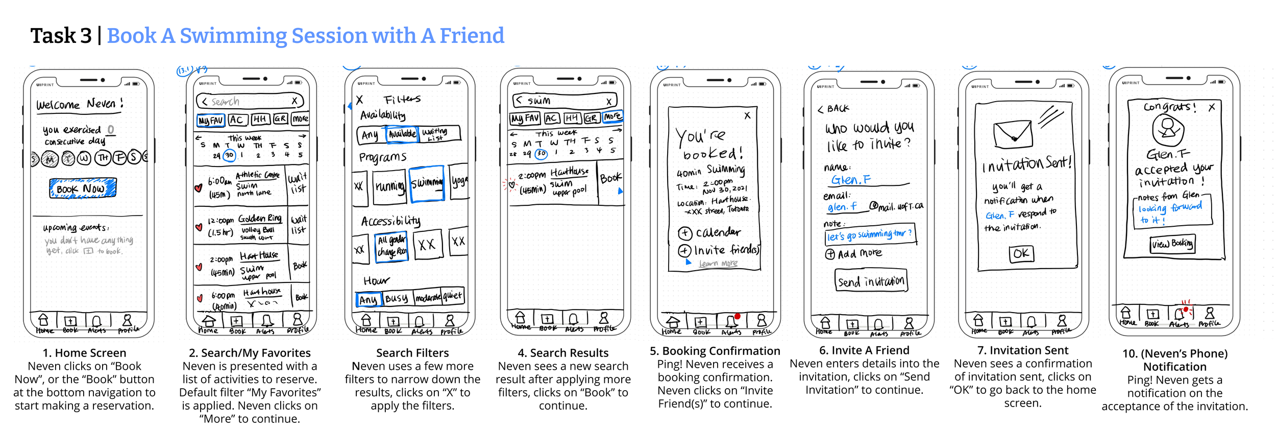
In the prototyping stage, the team started with pen and paper to sketch out the user flow of each task and experimented with some ideas on the screen layout. Once we reached a consensus, the team consolidated low-fi screens into one workflow per task.
Evaluation & User Feedback
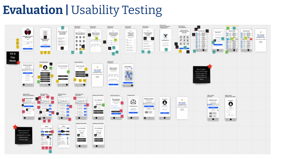
The team brought our low-fidelity prototypes to 4 users for evaluation and received some valuable feedback for the next iteration.
🎾 Users want to filter recreational programs by additional preferences, including woman-only, trans-friendly sessions etc
🎾 On top of the list view, users want to see a calendar view of all their reservations
🎾 Users want a quick way to filter out all wait-list programs/sessions
🎾 Users suggested some additional features to include in the user profile
Iteration 2: mid-fi key tasks
After the lean evaluation, the team took the feedback into the next iteration and created a mid-fi storyboard for the same tasks in Figma. We presented the improved design to the same users for another round of usability testing and incorporated the changes in the clickable prototype.
Additional Artifacts: Promo video & Prototype
I made a short promotional video to articulate the problems this App is trying to address.
Key Takeaways:
Divide and conquer during usability testing.
We only had one team member running the usability testing. This person was overwhelmed with giving instructions, taking notes and making observations all at once. If we had more time, we would like to have at least two facilitators per session, one for facilitation, and one for notetaking and observation, so that we do not miss subtle cues and feedback from the users.
Retrofitting new designs into old systems is challenging within mega organizations like the University.
This project only scratched the surface by introducing a user-friendly interface with enhanced features. Implementing this solution will require in-depth knowledge of the existing systems and cross-functional collaboration.
That is a wrap for now. Thank you for reading 👋