‘Fall-in-love’ at 2nd sight, 3rd or maybe 4th
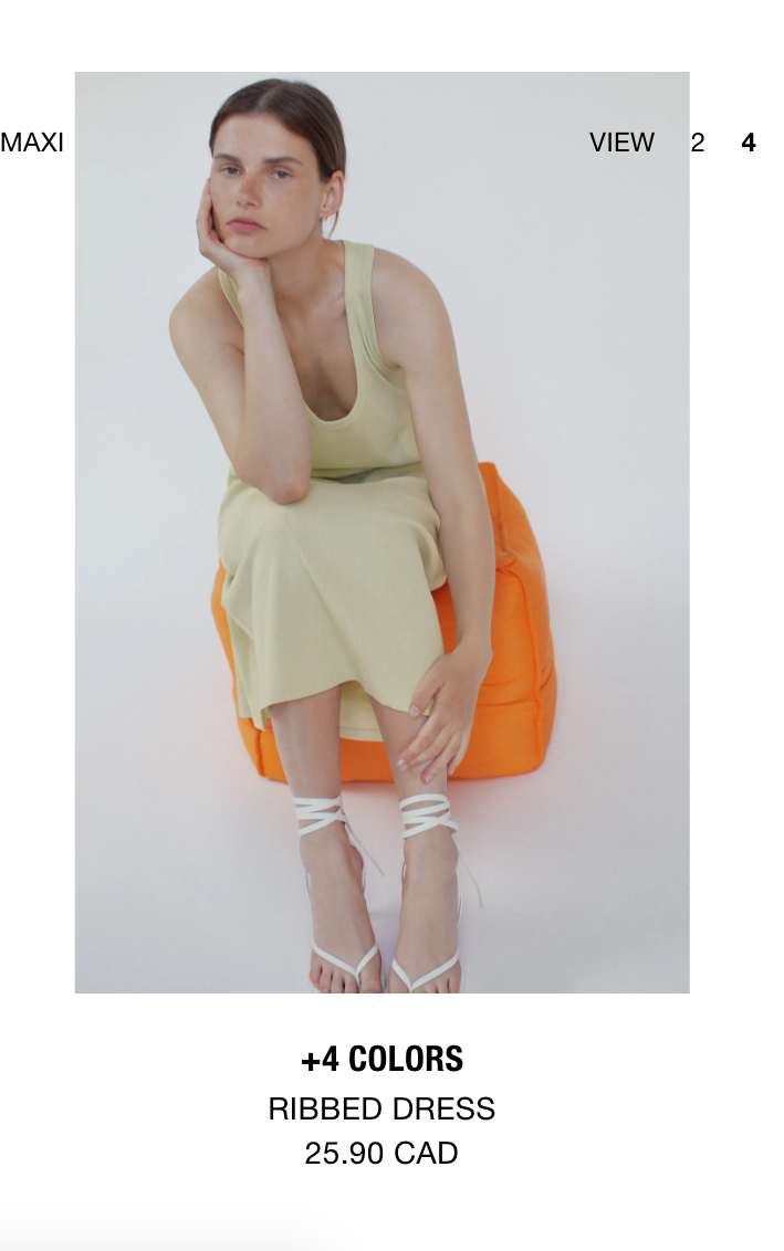
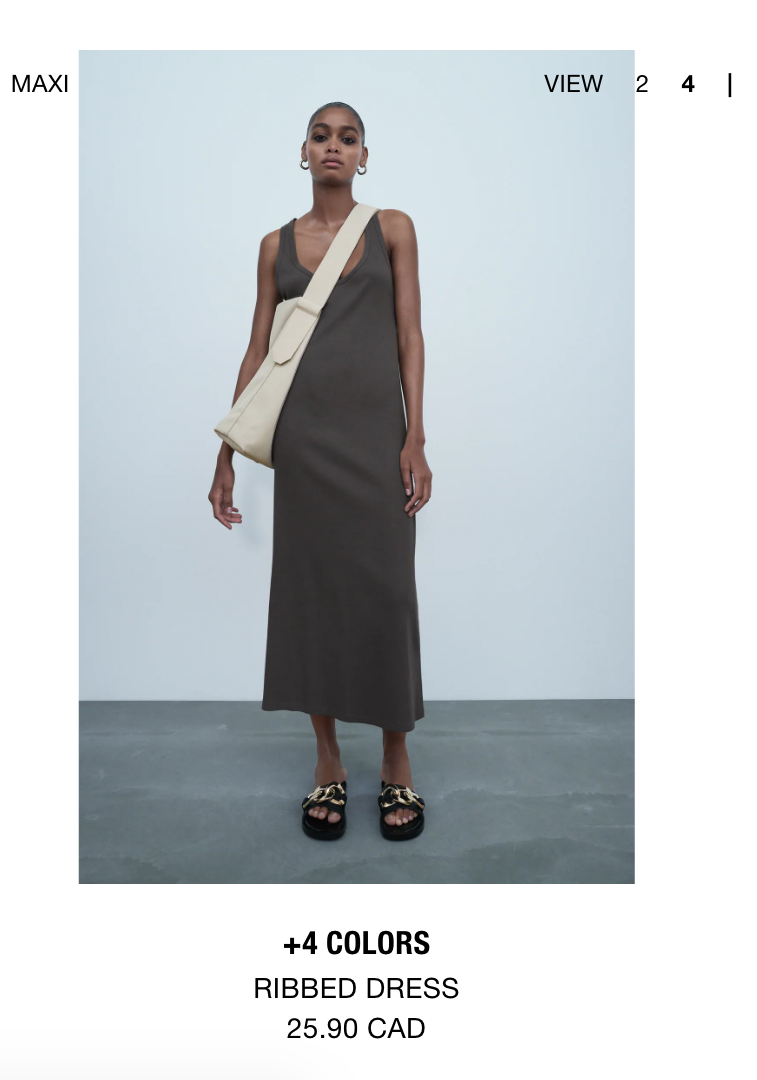
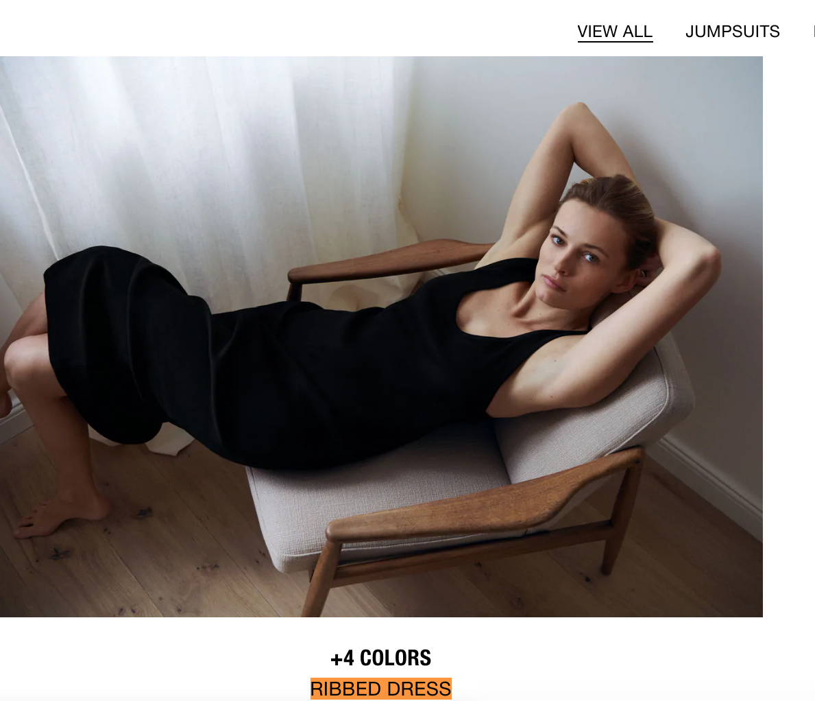
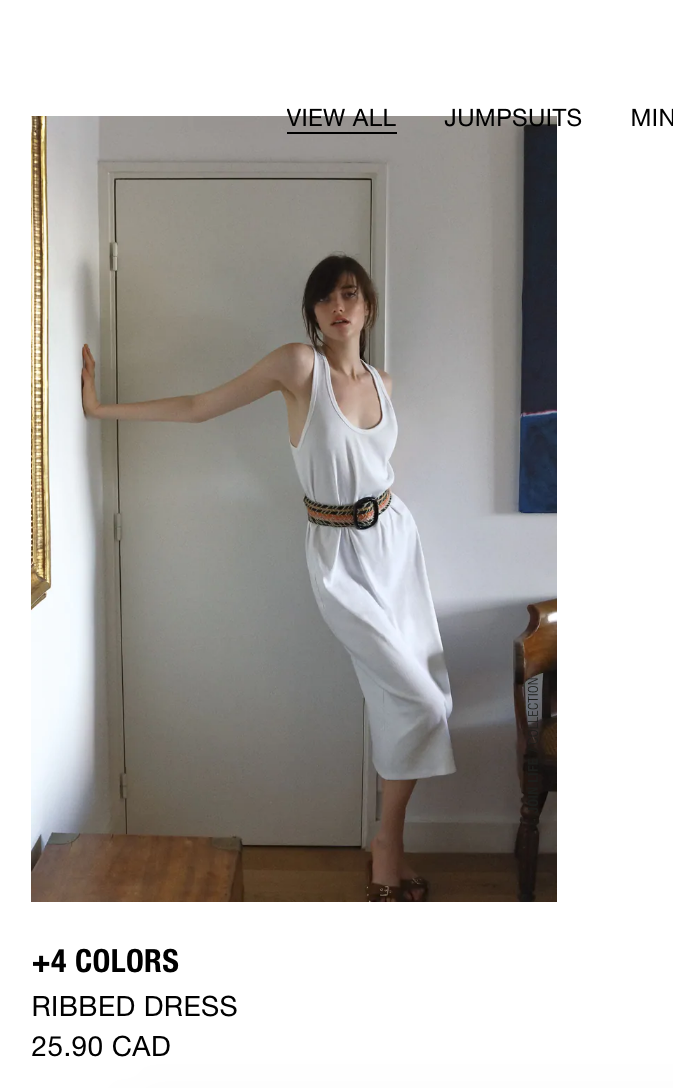
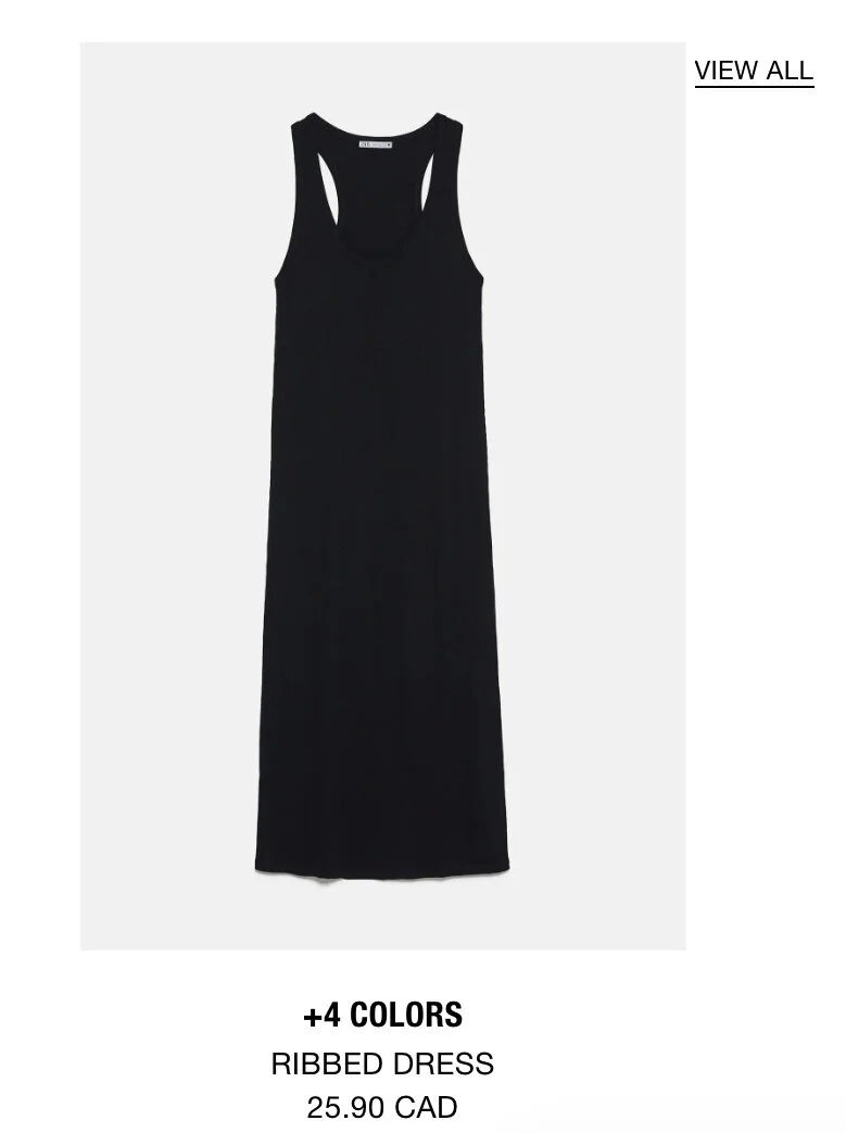
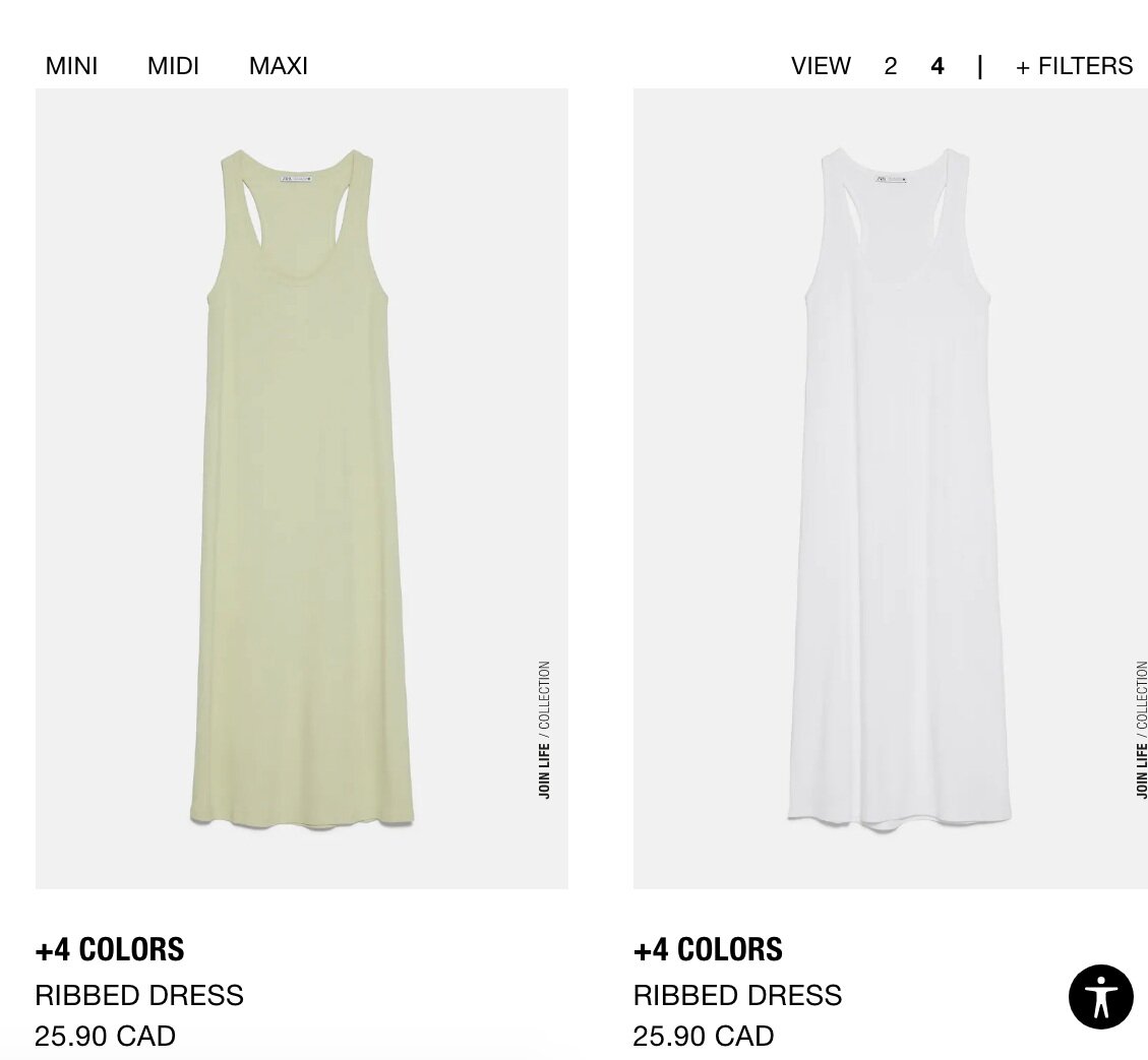
This ribbed dress followed me everywhere on Zara’s site in different colours, models and poses. I see what they are trying to do here, but pushing it 6 times in one web session is just too much.
If you had an eye on something but still thinking, the fastest way to convince you is to reinforce your initial click in every direction you look at. But if you have a good memory and in a bit of a rush, it’s super annoying to see the same product again and again, and it’s almost impossible to go through the entire catalogue without getting crazy. But this is not the end, wait until you escape to the Men’s section to shop for your partner. Guess what you’ll see among the shirts and pants? Your old friend, the ribbed dress! Surprise!
It’s going to be quick, only 3 pages
By now you already know that I like browsing online retailers, but I indeed feel guilty and overwhelmed about the number of hours spent on this. Apparently retailers know about this and they are trying something interesting by chunking the page number of their catalogue. I noticed this recently when browsing at a few major online retailers:
When I clicked on the “Dress” category, there were only “1 2 3” pages to display. I was like “oh, not too bad, let me see them all”, but as soon as I click on page 3, the page number expanded to “1 2 3 4 5 6 7” and if you click on the last page a few more times, there’s a whopping amount of 235 pages in total, and surely they know how to push you through the initial hump.
Just say “SALE” please
I don’t know since when, a lot of the online retailers became reluctant to the word “sale” on their websites. Instead they started to use words like “we made too much” or “private promotion” to hint the price reduction. An extreme example was with Everlane’s innovative “Choose" what you pay” campaign, where you can choose what to pay for the item from 3 incremental pre-set prices. Honestly, who wouldn't choose the lowest price? Even if so, is it worth the trade off of loosing the information scent of the website when most people can’t even find the sale section.
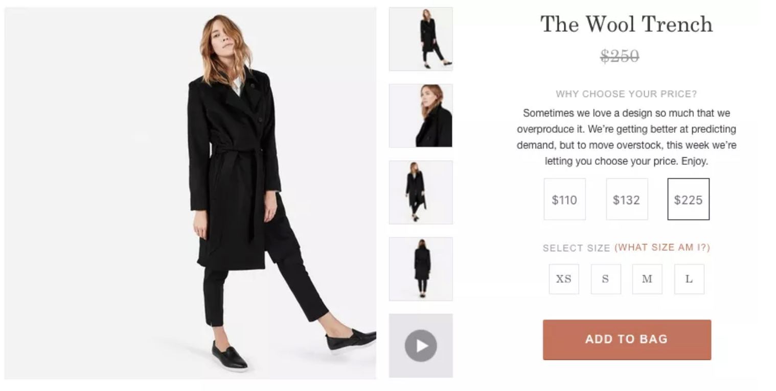
An example of Everlane’s choose what you pay.
With these new price reduction verbiage, I started to wonder if this is the same idea as the outlet, where so called luxury retailers don’t want to damp the brand prestige by displaying discounted merchandise with full priced ones in the same physical space, so they purposely tone up the “sale” into something obscure.
Or is this a mental game that retailers play with their regular customers, where it’s a well kept secret that only regulars will discover? I don’t have an explanation for this yet, but this is definitely one of most annoying trends I’ve observed with online retailers lately.